Preview image. Unlock full-res
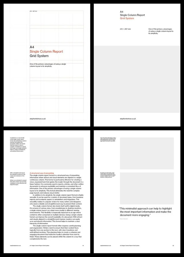
Four-page documentation of an A4 single-column report layout system with modular grid diagrams and typographic hierarchy guidance.
Summary
A four-page typographic and grid system guide for A4 single-column report layouts, with modular diagrams, dimension specifications, and extensive body copy on document structure.
Visual description
A 2x2 grid of four black-framed pages documenting the single-column report format. The top-left page shows a blank grid template with light rule lines and measurement annotations. The top-right page displays the same A4 format with a title ("A4 / Single Column Report / Grid System"), subtitle in red, dimension specs (210 x 297 mm), and explanatory text justified in a single column. The bottom two pages contain dense body text describing the format's advantages: the left page uses small black body copy over light gray backgrounds; the right page features a bold red subheading ("A structured way of presenting information") followed by justified body text. A small footer URL (slastherkelman.co.uk) appears on each page. The overall color palette is strictly black, white, and gray.
Key takeaway
The disciplined use of a single column with justified text hierarchy that guides the eye through dense information without visual clutter. The red accent color for critical headings provides just enough contrast to signal importance while maintaining overall visual calm. The modular grid approach makes the system instantly repeatable across documents.
Reuse notes
Ideal for corporate reports, academic documents, business analysis publications, and any context where readability and professional seriousness are paramount. The single-column approach reduces cognitive load and works well for print and PDF formats. The red accent works best with black-and-white content when you need one subtle but memorable color signal.
More like this







Keep what you find
A free account saves references to boards and can send you a weekly email of picks based on what you save.
To see every result, go Pro.