Preview image. Unlock full-res
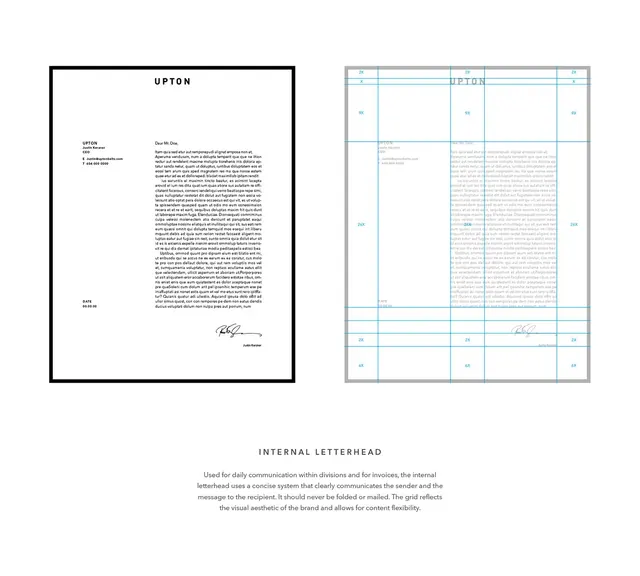
Brand letterhead for Upton showing structured grid-based layout with classic black frame and overlay of dimensional guidelines.
Summary
Upton brand letterhead showing a classic two-panel layout with the actual letter (left) and a grid-system diagram (right) explaining proportions and dimensional rules.
Visual description
Left panel: a crisp white letterhead framed in a thick black border with "UPTON" header, descriptive body text in small sans-serif, contact details on left margin, and a handwritten signature at bottom. Right panel: the same letterhead overlaid with a light blue grid showing key measurements (labeled 2x, 3x, 6x) and structural zones (header, body, footer). The grid uses thin blue lines and light gray frame border. Overall composition is rectilinear and highly organized, emphasizing the systematic proportions that govern the design.
Key takeaway
The two-panel teaching format: showing the finished artifact alongside a transparent measurement overlay that reveals the underlying geometry. Swiss-style dimensional labeling (2x, 3x spacing ratios) clearly visible. Black frame as a strong container that unifies both views.
Reuse notes
Excellent reference for brand-guideline documentation, especially legal or corporate identities. The grid-overlay technique works well in PDFs or presentation decks to explain how a logo, letterhead, or layout system scales and aligns. Pairs naturally with detailed brand guidelines where proportional rules matter.
More like this







Keep what you find
A free account saves references to boards and can send you a weekly email of picks based on what you save.
To see every result, go Pro.