Preview image. Unlock full-res
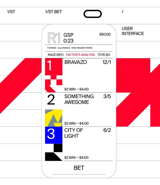
Sports betting application UI card displaying race information with geometric numbered badges, odds data, and color-coded selection indicators in a clean, minimal interface.
Summary
Sports betting application UI card displaying race information with geometric numbered badges, odds data, and color-coded selection indicators in a clean, minimal interface.
Visual description
A mobile-app-style card positioned on a grid overlay showing a sports betting interface. The top bar shows "1/ST", "1/ST BET", and a toggle icon separated by lines. A central rounded-corner card contains "GSP 0:23" header and "$50.00" indicator. The "RACE INFO", "FACTOR 5 ANALYSIS", and "TOTE BO" tabs appear as small text. Below, three race options are listed: a red-badged "1" for BRAVAZO with 12/1 odds, a yellow-badged "2" for SOMETHING AWESOME with 3/5 odds and "$2 WIN - $4.00", and a blue-badged "3" for CITY OF LIGHT with 6/2 odds. A black angular shape sits at the bottom left. Large bright-red and white diagonal geometric shapes dominate the left and right edges of the composition, creating visual frame. A "BET" button appears at the card base. The layout uses strict grid alignment and stark color contrast.
Key takeaway
The use of small, contained geometric badges to create visual identity for each selection option, making scanning quick and intuitive. The strategic placement of large angled shapes as background elements that don't compete with the core data hierarchy. The clear separation of interface zones using grid lines and color blocking, creating distinct functional areas without visual clutter.
Reuse notes
Excellent reference for fintech, betting, sports, or data-heavy applications where rapid information scanning is critical. The minimal color palette (red, blue, yellow on white) ensures accessibility and reduces cognitive load. The geometric sidebar elements add personality while maintaining professional credibility. Works well for mobile-first design or tablet UIs where real estate is limited.
More like this


Keep what you find
A free account saves references to boards and can send you a weekly email of picks based on what you save.
To see every result, go Pro.