Preview image. Unlock full-res
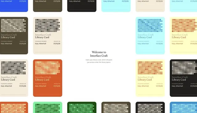
A modular library membership-card design system with pixelated grid patterns and muted earthy color variations, organized in a 3x4 showcase grid.
Summary
A modular library membership-card design system with pixelated grid patterns and muted earthy color variations, organized in a 3x4 showcase grid.
Visual description
A centered "Welcome to Interface Craft" headline introduces a grid of twelve card variants. Each card is a rounded rectangle with a bold pixelated grid pattern filling most of the card area, overlaid in small white or light squares on solid-color backgrounds. The palette shifts across variants: terracotta orange, olive green, dark forest green, slate gray, charcoal black, cyan blue, warm cream, and additional combinations. The header row shows colored card backs with "Katy Atherholt" and "01/15/26" in the top-right corner. Lower cards feature "Interface Craft Library Card" text and small-text details (Founding Member, Issued On dates). The composition demonstrates consistent card anatomy across the color range, emphasizing how a single modular pattern adapts to different brand colors while maintaining visual hierarchy and legibility.
Key takeaway
The pixelated-grid visual motif creates texture and visual interest without imagery, making it reproducible at scale and screen-agnostic. Using the same card template across diverse color backgrounds shows systematic thinking and makes the design feel like a cohesive system, not scattered experiments. The combination of rounded corners with hard-edged pixelation creates approachable modernism suitable for institutions.
Reuse notes
Ideal for membership programs, library systems, or loyalty cards where you want visual variety without complexity. The earthy palette pairs well with nonprofit, educational, or cultural organizations. Works equally well as digital or printed card. The pixelated grid pattern may feel dated in 10 years, so reserve this for projects where retro-geometric is intentional, not accidental.
More like this





Keep what you find
A free account saves references to boards and can send you a weekly email of picks based on what you save.
To see every result, go Pro.