Preview image. Unlock full-res
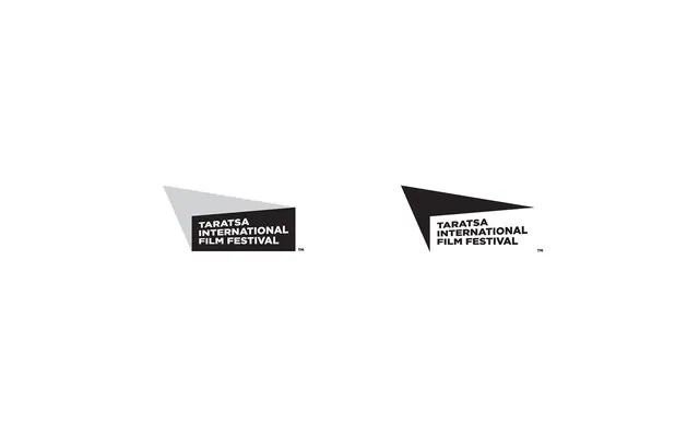
Logo system for Taratsa International Film Festival using angled geometric shapes in black and gray that frame a minimal wordmark.
Summary
Logo variants for Taratsa International Film Festival showing how sharp angular frames (left in gray, right in black) bracket the centered wordmark across different compositions.
Visual description
Two logo variations side by side against a light background. Left version uses a light gray angled parallelogram shape (pointing lower-right) containing a black rectangle with white all-caps type "TARATSA INTERNATIONAL FILM FESTIVAL" in sans-serif. Right version reverses the geometry: a sharp black triangle (pointing upper-right) frames the same white type in a black field. Both logos include a small trademark symbol. The angled shapes create dynamic forward momentum while the contained type stays calm and readable. The monochromatic palette (black, white, gray) emphasizes the geometric play and ensures versatile reproduction across media.
Key takeaway
The dynamic geometry of the frame itself as a brand mark, separate from but integral to the wordmark. Using two complementary angle directions (parallelogram vs. triangle) creates a cohesive system that feels both sharp and unified. The high contrast and geometric simplicity work at any scale and in any color context.
Reuse notes
Excellent for institutional or cultural organizations where a strong geometric signature adds prestige and modernity. The system allows flexible framing without losing brand recognition. Works equally well in single-color, on dark backgrounds, or as a badge. The angular forms read as dynamic and forward-thinking, suitable for arts, technology, or media.
More like this

Keep what you find
A free account saves references to boards and can send you a weekly email of picks based on what you save.
To see every result, go Pro.