Preview image. Unlock full-res
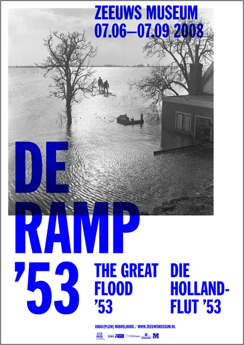
A Dutch modernist museum poster from 1953 layering cobalt-blue geometric typography over an archival black-and-white flood photograph.
Summary
A stark modernist exhibition poster for the Zeeuws Museum featuring a black-and-white historical flood photograph layered beneath bold cobalt-blue sans-serif type, exemplifying Dutch graphic design authority.
Visual description
Portrait-format poster with a historical black-and-white photograph dominating the upper two-thirds: a flooded landscape with bare trees, water extending to the horizon, and figures and buildings suggesting disaster. Overlaid on the lower left corner is large, all-caps cobalt-blue sans-serif typography reading "DE RAMP '53" (The Disaster 1953), with smaller text above reading "THE GREAT FLOOD" and "DIE HOLLANDFLUT '53" on the right. Near the bottom left, cream-colored text provides museum details and web address. The typography, rendered in a geometric sans-serif typical of 1950s Swiss/Dutch modernism, creates sharp contrast against the soft-focus photograph. The composition is asymmetrical, with text anchoring the lower-left quadrant and the archival image filling the rest, creating visual drama and historical weight.
Key takeaway
The juxtaposition of urgent geometric typography against archival or documentary photography to convey historical significance; the use of a single bold color (cobalt) to unify text and command attention without competing with the photograph; the asymmetrical, weighted-left composition that draws the eye down the poster while preserving the impact of the image; the confidence of all-caps sans-serif for cultural institutions.
Reuse notes
Ideal for museum posters, cultural-heritage exhibitions, historical documentaries, and institutional communications that need gravitas and authority. The bold geometric type style works across print and digital contexts. Best when paired with meaningful archival imagery that the typography can enhance rather than compete with. The cobalt-on-white and blue-on-black-and-white color scheme is versatile and prints crisply. Dutch modernist vocabulary (clean lines, grid discipline, bold color) reads as timeless and trustworthy.
More like this




Keep what you find
A free account saves references to boards and can send you a weekly email of picks based on what you save.
To see every result, go Pro.