Preview image. Unlock full-res
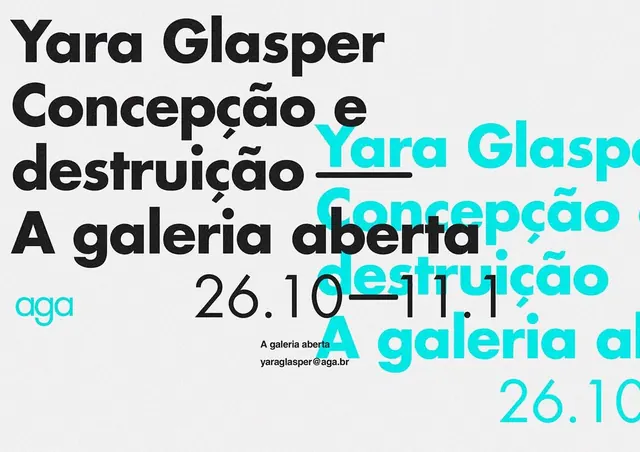
A graphic composition featuring overlapping Portuguese text and numerical elements in a structured, layered arrangement.
Summary
A graphic composition featuring overlapping Portuguese text and numerical elements in a structured, layered arrangement.
Visual description
The design features bold black and blue sans-serif text layered over a light gray background. Elements like 'Concepção e destruição' and 'A galeria' are repeated and offset, creating a sense of depth and movement.
Key takeaway
The use of overlapping typography and high-contrast colors creates a dynamic, structured visual hierarchy.
Reuse notes
Apply this overlapping typographic technique to create depth in editorial layouts or posters.
More like this


Keep what you find
A free account saves references to boards and can send you a weekly email of picks based on what you save.
To see every result, go Pro.