Preview image. Unlock full-res
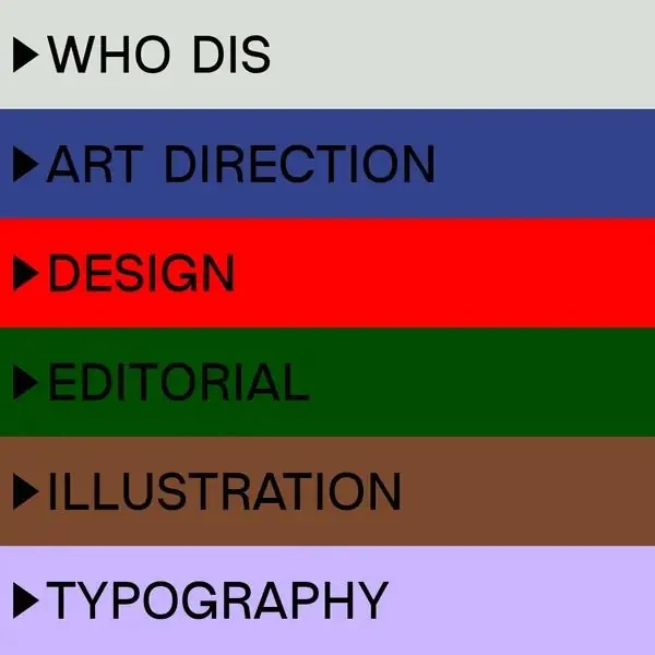
Six horizontal color bands label creative disciplines (Who Dis, Art Direction, Design, Editorial, Illustration, Typography) with triangular play icons and black sans-serif type.
Summary
A vertical menu index of six creative disciplines, each assigned a distinct saturated color band with triangular play icons and caps-set sans-serif labels.
Visual description
Six equal-height horizontal bands stack vertically, each filled with a different saturated color: gray-beige, deep indigo, bright red, forest green, warm brown, and lilac. Black sans-serif labels (Who Dis, Art Direction, Design, Editorial, Illustration, Typography) are flush-left with matching black triangular play icons. The fields are cleanly abutted with no spacing between bands, creating a bold, modular effect.
Key takeaway
The color-as-category system: assigning a distinct saturated hue to each item in a vertical list so color itself becomes the visual index. The triangle-and-label pairing is a compact way to signal interaction or navigation within a minimal frame.
Reuse notes
Strong for creative service directories, agency discipline breakdowns, or institutional menus where categorization visibility matters. Works best when the list is short (5-8 items) and each category carries equal weight. The palette leans institutional; tone shifts cool if you swap warm and cool bands.
More like this




Keep what you find
A free account saves references to boards and can send you a weekly email of picks based on what you save.
To see every result, go Pro.