Preview image. Unlock full-res
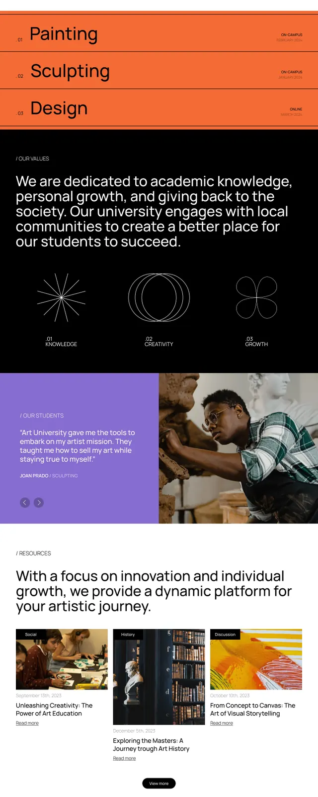
Full-length website mockup for a design school using alternating dark and light sections with typography focus, warm accent colors, and stacked content blocks.
Summary
Multi-section website layout for a design school alternating dark and light backgrounds, using large sans-serif typography, three named disciplines (Painting, Sculpting, Design), and warm color accents (orange, purple) in imagery.
Visual description
A tall, mobile-oriented layout showing six distinct sections stacked vertically. Section 1 (dark hero): white headline and white text on black with a centered white CTA button. Section 2 (light): headline and subtext. Section 3 (dark): three labeled pill buttons in a grid ("PAINTING", "SCULPTING", "DESIGN") on black, each paired with a vibrant image (warm orange tones, purple studio scene, clay work). Section 4 (light): headline, descriptive text, and statement on the school's mission. Section 5 (dark): three image blocks in a row showing warm tones and crafted work. Section 6 (light): a "CONTACT US" footer section with text and a white button. The entire layout uses maximum contrast between background colors (black/white) and strong modular spacing with clear whitespace between blocks.
Key takeaway
The principle of alternating dark and light sections to create rhythm and separate content areas without heavy dividers. The use of large, bold sans-serif type that scales dramatically to anchor each section. The warm accent colors (orange, purple) in imagery contrast sharply with the monochromatic background structure. The three-column grid of disciplines with accompanying images creates a quick visual summary of the school's focus. Clear hierarchy through color, spacing, and type weight alone.
Reuse notes
A strong template for education and creative-service websites that need to showcase multiple programs or disciplines. Works well for design schools, art academies, creative agencies, and portfolio sites. The high contrast and clear modular sections make it adaptable to both desktop and mobile. Use this structure when balancing heavyweight typography with supportive imagery and needing to separate distinct content areas.
More like this


Keep what you find
A free account saves references to boards and can send you a weekly email of picks based on what you save.
To see every result, go Pro.