Preview image. Unlock full-res
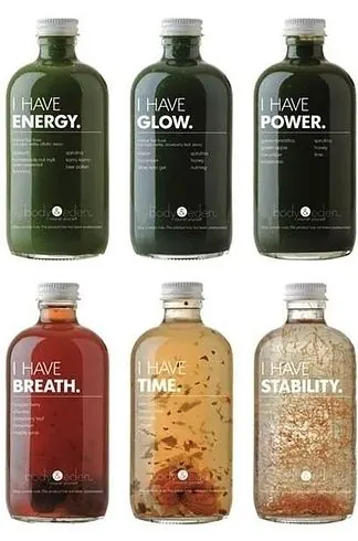
A grid of six glass bottles with minimal labels featuring large white statements like “I HAVE ENERGY” and “I HAVE STABILITY.”
Summary
A grid of six glass bottles with minimal labels featuring large white statements like “I HAVE ENERGY” and “I HAVE STABILITY.”
Visual description
Six glass bottles are arranged in a 3-by-2 grid on a white background. Each bottle has a very simple label with a large phrase in white text, including ENERGY, GLOW, POWER, BREATH, TIME, and STABILITY, and the liquid inside each bottle varies in color and texture.
Key takeaway
Use a strong typographic headline as the primary packaging feature and keep everything else quiet. The repetition across a grid makes the concept feel like a system instead of a one-off label.
Reuse notes
Reach for this when the product story is best told through a short, declarative phrase and the package itself needs to feel premium and simple. It works well for beverage, wellness, or concept packaging where visual restraint helps the message land.