Preview image. Unlock full-res
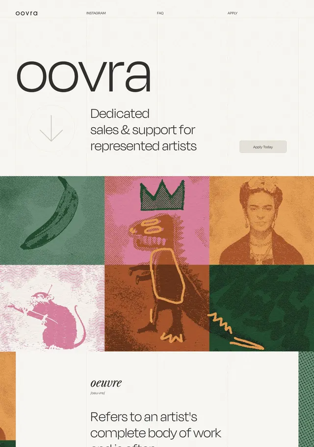
An artist-support platform homepage with large wordmark, editorial grid of artist photography, and warm earthy color palette.
Summary
An artist-support platform homepage with large wordmark, editorial grid of artist photography, and warm earthy color palette.
Visual description
Cream background with OOVRA wordmark (large, sans-serif) in the top-left. Header navigation (INSTAGRAM, FAQ, APPLY) aligns right. Tagline in serif italic: "Dedicated sales & support for represented artists." Below, a 3x2 grid of color-blocked photograph tiles in alternating teal, pink, orange, brown, and white; each tile contains a textured, screen-printed aesthetic image of artists and symbolic objects. Footer contains etymology definition in serif italic: "oeuvre" means "an artist's complete body of work." Warm, earthy tones (mustard, terracotta, forest green) unify the grid against the neutral background. Clean typography hierarchy uses sans-serif for interface copy and serif for editorial tone.
Key takeaway
Color-blocking in a grid grid creates visual rhythm without borders or gaps. Mixing serif and sans-serif (serif for the oeuvre definition, sans for nav) anchors editorial tone. Muted warm palette (oranges, greens, browns) conveys artist credibility over trendy neon.
Reuse notes
Effective for creative platforms, artist collectives, or portfolio sites that need warmth and editorial authority. The grid pattern scales to different image counts. Avoid when seeking contemporary minimalism; the textured, printed aesthetic reads vintage-forward.
More like this



Keep what you find
A free account saves references to boards and can send you a weekly email of picks based on what you save.
To see every result, go Pro.