
Preview image. Unlock full-res
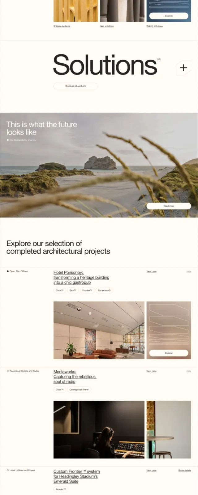
Vertical design system presentation layering deep burgundy, cream, and warm greys with generous whitespace and left-aligned typographic hierarchy.
Summary
Multi-page design system using deep burgundy bar accents, cream backgrounds, and generous whitespace to organize typography, color, and imagery into a cohesive luxury brand language.
Visual description
Tall document layout (possibly PDF or web scroll) with repeating section structure: each page begins with a horizontal deep burgundy bar, followed by cream or off-white content areas with left-aligned black sans-serif headings, body copy in smaller type, and supporting interior photography. The color palette is warm and restrained (burgundy, cream, muted gold, soft grey). Horizontal rule elements in the accent color separate sections. Text is left-aligned with ample breathing room. A few pages feature full-width photography or product/interior shots. The overall rhythm alternates between text-heavy sections and visual breathing space.
Key takeaway
The use of a single horizontal colored bar as a section anchor and visual break is economical and readable. The warmth of the burgundy and cream pairing feels elevated without being cold or corporate. Large type sizes with short line lengths for headings, paired with generous margins, make the document feel spacious and premium. The structured repetition of the burgundy bar + cream body creates a predictable, scannable flow.
Reuse notes
Ideal for luxury brands, design studios, interior firms, or high-end B2B services. The warm palette works best in editorial and brand-system contexts. The vertically scrolling layout is native to PDFs and modern web; adapts well to long-form digital documents, annual reports, and design guidelines. Less suitable for fast-paced or casual brands.
More like this


Keep what you find
A free account saves references to boards and can send you a weekly email of picks based on what you save.
To see every result, go Pro.