Preview image. Unlock full-res
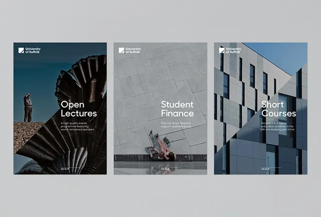
Three-poster academic branding system for university services, each featuring distinct photography and a tight header with small white text overlay.
Summary
Three-poster academic branding system for university services, each featuring distinct photography and a tight header with small white text overlay.
Visual description
A grid of three upright posters displayed side-by-side. Each poster has a compact header zone with a university logo and service title in small white sans-serif type, followed by a large photograph filling the lower two-thirds. The left poster (Open Lectures) shows organic shell or fan-like spiral geometry in dark tones. The center poster (Student Finance) features neutral gray architecture. The right poster (Short Courses) displays blue-sky architectural photography of a modern building facade. The posters share a consistent layout grammar: minimal text, large imagery, cool color palette, and crisp typography. The overall effect is institutional yet contemporary.
Key takeaway
The modular three-poster system proves that consistent layout and type hierarchy can unify vastly different photographic subjects. The tight header zone with logo plus title sets a professional academic tone without excess decoration. The generous photo areas and generous white margins convey quality and breathing room, signaling high-level institution.
Reuse notes
Ideal template for university service branding, corporate divisions, or any multi-offering institution. The photography-first approach works when you have strong subject matter to feature. Pair with cool grays and blues for academic/professional sectors; adapt colors for other industries while maintaining the hierarchy and spacing logic.
More like this






Keep what you find
A free account saves references to boards and can send you a weekly email of picks based on what you save.
To see every result, go Pro.