Preview image. Unlock full-res
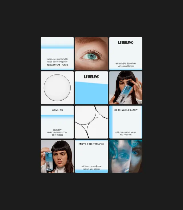
A 3x4 grid of product cards mixing photography and abstract shapes to sell contact lens varieties and eyewear solutions.
Summary
A 3x4 modular grid of product cards mixing close-up photography, abstract line graphics, and branded taglines to showcase contact lens varieties and eyewear solutions.
Visual description
Dark charcoal background frames a 12-card grid layout in a light palette. Top left shows a blue gradient bar above copy about comfortable vision and "OUR CONTACT LENSES." The top center card isolates a blue eye with lashes. Top right displays the Lively wordmark and "UNIVERSAL SOLUTION for contact lenses." Middle cards alternate between product photos (a woman inserting a lens, a woman holding a blue case), minimal line drawings (a circle outline, organic flowing curves), branded copy cards (address, phone number, "COSMETICS"), and teal-accented messages ("SEE THE WORLD CLEARLY," "with our contact lenses and solutions," "FIND YOUR PERFECT MATCH," "with our customizable contact lens options"). A single sans-serif typeface runs throughout in a tight hierarchy. Color blocking in teal blue and neutral white grounds each card's message.
Key takeaway
The modular grid system using uniform square card proportions allows mixed content types (photo, text, diagram, logo) to sit harmoniously without hierarchy conflict. The teal accent color creates visual continuity across disparate card types. Negative space within cards and between them prevents visual clutter despite dense information.
Reuse notes
Excellent model for healthcare and ecommerce product galleries. Works well for portfolios mixing photography and minimal iconography. The color scheme reads trustworthy and clinical without coldness. Best suited for B2C consumer-facing brands wanting to showcase variety while maintaining order.
More like this




Keep what you find
A free account saves references to boards and can send you a weekly email of picks based on what you save.
To see every result, go Pro.