Preview image. Unlock full-res
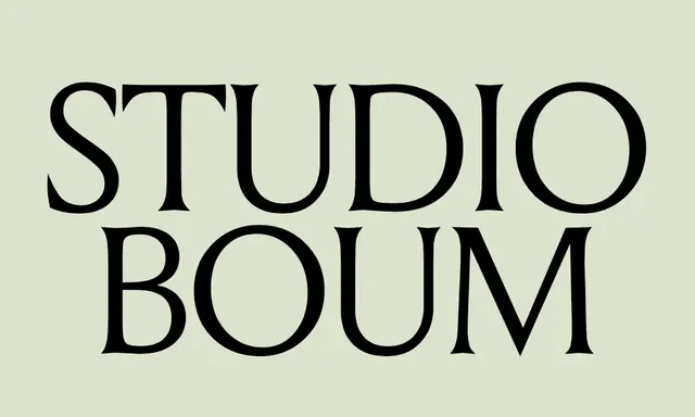
Two-line serif wordmark centered on a soft sage green ground, using a classical high-contrast typeface for a design studio identity.
Summary
A centered, two-line serif wordmark in black on a soft sage green ground, exemplifying classical restraint in design-studio branding.
Visual description
Horizontally centered composition on a light sage-green background. The text 'STUDIO' appears in the upper line, 'BOUM' below, both in a refined serif typeface with strong, elegant letterforms and uniform stroke weight. The high contrast between the black type and the muted green creates visual clarity while the generous letter-spacing and vertical stacking maintain an unhurried, contemporary feel.
Key takeaway
The discipline of a single typeface, neutral palette (black and cream/green), and centered composition conveying sophistication without embellishment. The understated serif treatment modernizes classical identity traditions without pastiche.
Reuse notes
Ideal for creative agencies, architectural practices, editorial brands, or any studio seeking an identity rooted in typographic confidence. Works best at large scale and in print or premium digital contexts. The muted sage-green pairs well with cream, white, or natural materials.
More like this


Keep what you find
A free account saves references to boards and can send you a weekly email of picks based on what you save.
To see every result, go Pro.