Preview image. Unlock full-res
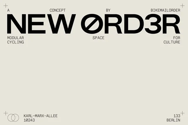
A stark, grid-based typographic specimen featuring massive black sans-serif letterforms distributed across an off-white field with minimal context and cardinal-point metadata.
Summary
A stark typographic specimen for the typeface NEWORDER3R, with massive black letters arranged across an off-white ground and metadata positioned at cardinal points and corners.
Visual description
A single-page type specimen layout on an off-white background with minimal borders defined by hairline crosshairs at all four corners. The headline "NEWORDER3R" is set in an ultra-heavy, geometric black sans-serif at enormous scale, dominating the center third of the composition. Context labels are distributed around the central letterforms: "A CONCEPT" and "BY BIKEMAILORDER" appear above in smaller caps; "MODULAR CYCLING", "SPACE", and "FOR CULTURE" are positioned at left, center, and right below the main typeface demonstration. Bottom left corner contains a minimal two-circle logo and address information: "KARL-MARX-ALLEE 10243 BERLIN"; bottom right shows page number "133". The entire design operates on a strict grid with generous breathing room, relying on scale contrast between the monumental headline and supporting text set in a lighter-weight sans-serif.
Key takeaway
The discipline of extreme simplicity: one typeface in one weight (the heavy display version) paired with minimal context, allowing the letterforms themselves to become the primary visual content. The cardinal-point distribution of metadata around the center creates spatial rhythm without decorative elements. The use of corner marks and a subtle grid reinforces the austere, institutional feel. This approach works because the typeface itself is interesting enough to merit that kind of focus.
Reuse notes
Essential reference for design studios, cultural institutions, or contemporary art contexts where intellectual rigor and reduction are valued. Works particularly well for typeface publications, architectural identity systems, and institutional branding that needs to convey seriousness and craft. The layout principle translates to any context where a single strong element (typeface, image, message) should dominate and supporting information is secondary. Not suitable for commercial, warm, or accessible contexts where approachability is the goal.
More like this


Keep what you find
A free account saves references to boards and can send you a weekly email of picks based on what you save.
To see every result, go Pro.