Preview image. Unlock full-res
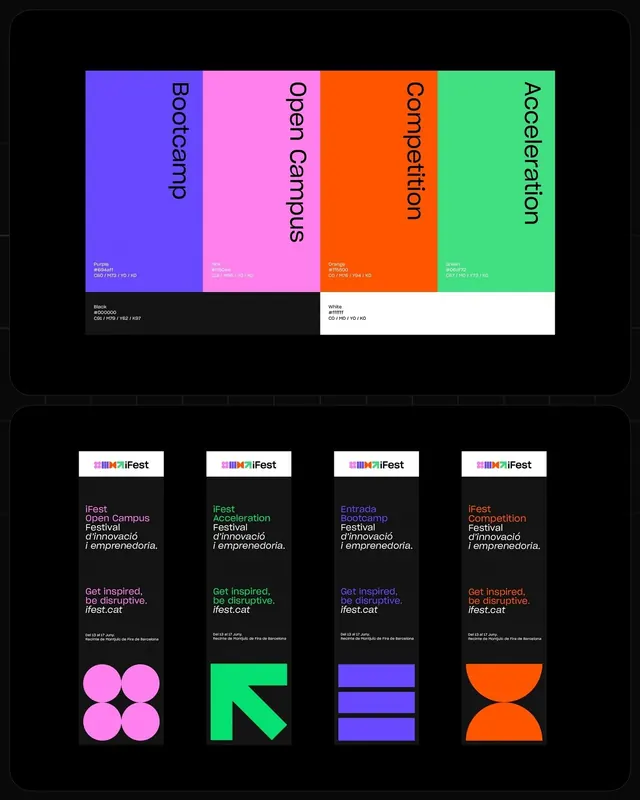
Vibrant four-color palette guide for iFFest innovation festival branding, with paired event cards and geometric accent shapes in neon magenta, indigo, orange, and green.
Summary
Festival branding system for iFFest with four neon primary colors (indigo, magenta, orange, green) plus black and white, paired with event card templates and geometric icons for a tech-forward innovation festival identity.
Visual description
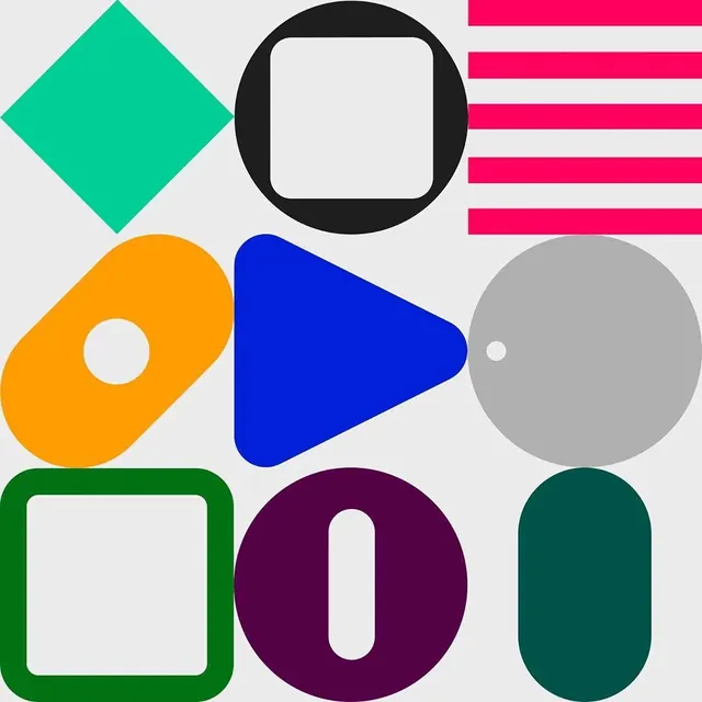
The top half displays a color palette card row: four equal-width vertical blocks labeled "Bootcamp," "Open Campus," "Connection," and "Accelerator," each in its assigned color (indigo, hot pink, orange, bright green respectively) with white text listing color values. Below this are black and white reference swatches with RGB and HEX codes. The bottom half shows four promotional event cards on black background, each with the white iFFest logo, a color-labeled event name ("Open Campus Festival," "Acceleration Festival," "Bootcamp Festival," "Competition Festival"), a Catalan description, green "Get inspired, be disruptive" tagline, event date and location, and a solid-color geometric shape icon (pink circles, green arrow/chevron, indigo bars, orange semicircles).
Key takeaway
The tetradic color approach with deliberate neon saturation; using solid geometric shapes as recognizable visual anchors paired to each brand color; the dual-use palette system that works as both a primary color guide and secondary accent system. The scale of color blocks and all-caps oversized naming makes each color unmistakable and memorable.
Reuse notes
Strong for innovation programs, education events, festivals, and startup/tech communities that need a bold, inclusive, contemporary identity. The geometric shape system scales well across applications (event posters, web headers, merchandise). Best when paired with clean sans-serif type and plenty of white space to let the color system breathe.
More like this

Keep what you find
A free account saves references to boards and can send you a weekly email of picks based on what you save.
To see every result, go Pro.