Preview image. Unlock full-res
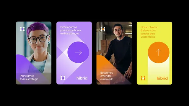
Four stacked presentation cards for Hybrid brand, each combining portrait/brand photography with large geometric overlays in purple, orange, and yellow tones.
Summary
Four modular brand cards featuring portrait or brand photography with large geometric color overlays, Portuguese copy, and the Hybrid logo mark on black.
Visual description
Black background arranges four rounded-corner cards horizontally in equal columns. Each card combines a photograph (person, portrait, or workspace) with a large semi-transparent or solid geometric shape: the first and third feature purple crescents and tone shifts; the second is a bright purple card with a large solid circle and white diagonal arrow; the fourth is a bright yellow card with an orange circle and upward arrow. Portuguese headline text ('Planejamos toda estrategia', 'Direcionamos...', 'Buscamos entender o mercado', 'Nosso objetivo...') and smaller descriptive copy overlay the images. A small white logotype and dot-grid icon appear on each card, anchoring the Hybrid brand. Color palette emphasizes complementary purple and yellow with orange accents.
Key takeaway
Layering a bold geometric shape over photography creates a modern, design-forward presentation. The color overlays unify disparate images and add visual rhythm across the card series. The dot-grid logotype and arrow iconography are compact brand marks that scale well. The alternating accent colors (purple-to-yellow) create a forward momentum.
Reuse notes
Excellent for B2B services, consulting, and agency presentations where you need to feature team members or office moments. Works well for product decks and company introductions. The color blocking can feel trendy; avoid for conservative industries like law or finance. Best when paired with strong, high-contrast photography and very few, short text lines.
More like this






Keep what you find
A free account saves references to boards and can send you a weekly email of picks based on what you save.
To see every result, go Pro.