Preview image. Unlock full-res
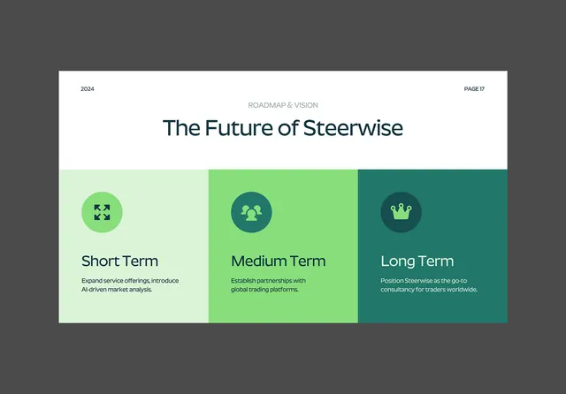
Consultancy-style roadmap slide with a three-stage timeline in a gradient-colored grid beneath a serif headline.
Summary
A strategic-vision slide organizing three timeframe stages (short, medium, long) as equal-width columns with gradient backgrounds, icons, and body copy in a clean grid.
Visual description
Light off-white background. Header section with small-caps label "ROADMAP & VISION" in muted gray, followed by a large serif headline "The Future of Steerwise" in dark teal. Below, a three-column grid spans the width. Each column has a soft gradient background (pale mint, bright lime, deep teal), a circle icon at the top in a darker shade, a serif heading ("Short Term," "Medium Term," "Long Term"), and three lines of dark body copy. The columns are evenly spaced and the icons use simple geometric symbols (expand arrows, silhouettes, crown). Clean sans and serif pairing, generous negative space.
Key takeaway
The gradient-background columns are a subtle way to separate stages without hard lines or boxes. The hierarchical use of serif (headline and section heads) versus sans (body) adds formality. Icon placement (top, centered) and the consistent column width creates visual rhythm that's informative without being overly designed. It scales well to different timeframe counts (can become 4-5 columns).
Reuse notes
Ideal for strategic decks, roadmap presentations, and forward-looking company communications. The gradient backgrounds can be swapped to match a brand palette. Works best when each column is genuinely distinct in scope or color; if colors are too similar the separation flattens. Keep icon style simple and consistent.
More like this







Keep what you find
A free account saves references to boards and can send you a weekly email of picks based on what you save.
To see every result, go Pro.