Preview image. Unlock full-res
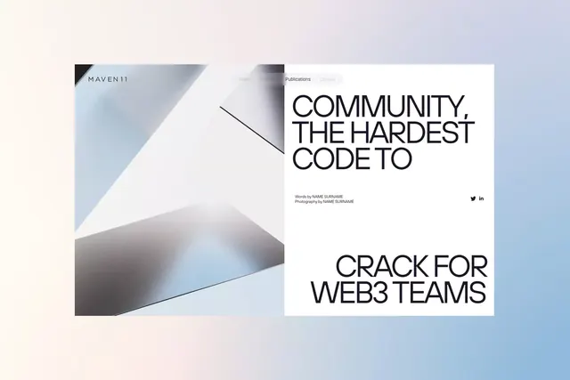
Left half shows a dark-to-light angled triangle gradient; right half displays bold sans-serif headline on white with navigation and footer metadata.
Summary
Split-screen layout with a soft pastel gradient triangle on the left and bold sans-serif headline on white on the right, minimal navigation top center.
Visual description
Soft gradient background (pale cream to cool blue). Left half contains a large angled triangle shape transitioning from cool gray-blue at top to white and pale blue at bottom, creating depth and visual movement. Top left corner shows "MAVEN11" logotype. Right half is a clean white background with minimal navigation (Team, Portfolio, Publications, Contact) at top center in light gray. Centered is a bold black sans-serif headline: "COMMUNITY, THE HARDEST CODE TO" stacked across three lines. Below is body copy: "Words by NAME SURNAME, Photography by NAME SURNAME" in small dark type. Bottom right has social icons (Twitter, LinkedIn). The geometric triangle on the left balances the text-heavy right side.
Key takeaway
Asymmetric split layouts split the design burden: geometry and gradient carry visual interest on one side, leaving the opposite side pure type and negative space. The angled triangle creates subtle movement and depth without being showy. Clean minimalist navigation floats above both halves, unifying the composition.
Reuse notes
Strong pattern for tech recruiting, B2B SaaS, or Web3 brands needing to convey both innovation and professionalism. The angled geometry works as a hero section on a landing page. Minimal navigation overhead keeps focus on the headline. Adapt the gradient colors to match brand palette.
More like this

Keep what you find
A free account saves references to boards and can send you a weekly email of picks based on what you save.
To see every result, go Pro.