Preview image. Unlock full-res
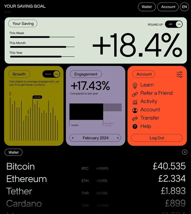
Dark fintech dashboard using three distinct card colors (olive, purple, coral) to organize savings goals, engagement metrics, and account actions alongside crypto holdings list.
Summary
A dark fintech dashboard that organizes savings metrics, engagement stats, and account controls into three distinct colored cards while displaying live crypto holdings at the bottom.
Visual description
Dark background with top navigation showing "YOUR SAVING GOAL", wallet/account toggles, and language selector. Upper section features a pale-green card labeled "Your Saving" with a "ROUND UP" toggle and +18.4% in large sans-serif, backed by weekly, monthly, and yearly progress bars. Below, three color-blocked cards: an olive card showing "Growth" with vertical bar charts labeled "CUSTOM", a purple card labeled "Engagement" with +17.43% and a February 2024 date picker below a data chart, and a coral card labeled "Account" with menu items (Learn, Refer a Friend, Activity, Account, Transfer, Help) and a Log Out button. Bottom section lists crypto holdings in light text with ticker symbols, percentage changes, and pound sterling values (Bitcoin, Ethereum, Tether, Cardano). A Wallet button anchors the bottom left.
Key takeaway
The disciplined use of color to create semantic regions within a crowded interface; the contrast between dark background and warm accent cards that guides focus; large percentage callouts with supporting data visualization that tells the story quickly.
Reuse notes
Ideal for fintech, cryptocurrency, and investment platforms where users need to scan multiple metrics at once. The card-based structure allows modularity and future expansion. Works well on mobile due to vertical stacking. The three-color palette (olive, purple, coral) could shift for different brands; the key is maintaining high contrast against the dark background. Crypto holdings display at bottom works for secondary information hierarchy.
More like this



Keep what you find
A free account saves references to boards and can send you a weekly email of picks based on what you save.
To see every result, go Pro.