Preview image. Unlock full-res
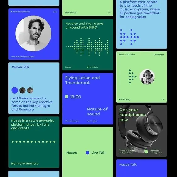
A grid-based podcast platform interface using neon color blocks (indigo, teal, lime) to separate cards for episodes, live talks, featured speakers, and call-to-action buttons.
Summary
A podcast platform UI composed of rectangular cards in bright neon colors (indigo, teal, lime) arranged in an irregular grid, displaying episode titles, speaker avatars, live talk schedules, and headphone product imagery.
Visual description
A vertical collage of uneven rectangular cards in primary neon colors. Left column: light blue card showing episode count and speaker info; dark teal card with white dot pattern and serif title "Flying Lotus and Thundercat" in magenta and white; light blue card with speaker avatars and event text. Center column: bright lime-green cards with teal heading, speaker circles, and call-to-action text; deep indigo blue card with "Nature of Sound" title and time stamp. Right column: light blue card with descriptive copy; bright lime card with dark image of headphones and download CTA button; dark blue card with repeated "Muzos Talk" label. All text uses clean, legible sans-serif. The composition feels dense and modular, with each card functioning independently but cohesively. White, green, and teal dots appear as decorative visual elements connecting related cards.
Key takeaway
The audacious use of neon color blocks as information separators rather than mere decorative backgrounds; the colors do structural work organizing disparate content types. The irregular card grid feels modern and dynamic while remaining readable. Avatar circles and product photography add personality without cluttering. The combination of bold sans-serif headlines with extended description text creates clear hierarchy. Accent colors (magenta, white) pop against the neon base palette.
Reuse notes
Strong for media, podcast, or music app interfaces seeking energy and visual distinction. The modular card approach scales to content-rich dashboards. High contrast is especially valuable for mobile or smaller screens. The neon palette works well for youth-facing or creative platforms but may feel too intense for corporate/fintech contexts. Pairs well with illustrated or photographic product shots. Dense information architecture benefits from this structured, colorful treatment.
More like this


Keep what you find
A free account saves references to boards and can send you a weekly email of picks based on what you save.
To see every result, go Pro.