Preview image. Unlock full-res
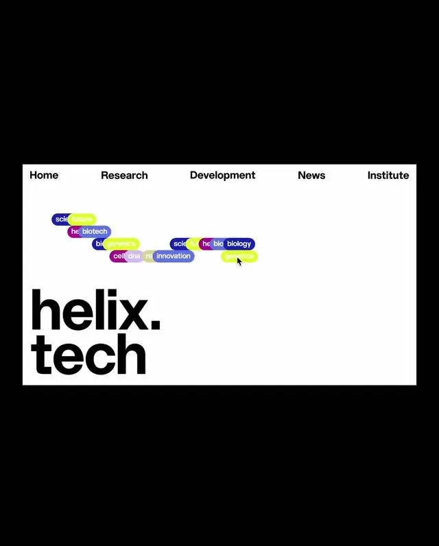
Navigation bar and oversized wordmark anchored by scattered neon tag labels, stark monochrome foundation for research and biotech branding.
Summary
Stark monochrome header with horizontal navigation bar and oversized "helix.tech" wordmark anchored by scattered neon pill badges labeling research areas (biology, innovation, development).
Visual description
White background dominates. Top edge shows a five-item horizontal navigation bar (Home, Research, Development, News, Institute) in black sans-serif. Below, scattered across the upper-center area, are small pill-shaped badge labels in alternating colors: neon yellow-green, hot pink, purple, and cyan, each containing white text (words like "science," "biology," "innovation," "development"). The labels are loosely scattered rather than gridded, creating organic visual rhythm. Below these badges sits the wordmark "helix.tech" in a massive, heavy black sans-serif font filling the lower frame. Black border or frame edge surrounding the white background.
Key takeaway
The juxtaposition of rigid (navigation bar, monochrome palette, straight edges) and loose (scattered neon tags creating movement) creates energy without breaking cleanliness. The oversized wordmark anchors institutional confidence while the loose tag scatter suggests agile, collaborative research. Neon accents (applied sparingly to small elements, not the whole) pop against monochrome and read as modern/tech even in a formal context.
Reuse notes
Best for research institutions, biotech, developer tools, or academic/B2B brands wanting credibility with energy. The scattered badges work as a tag taxonomy or research-area browser. Scale the neon accent colors carefully; works only on white or very light backgrounds. Navigation can drop if needed for a standalone hero.
More like this



Keep what you find
A free account saves references to boards and can send you a weekly email of picks based on what you save.
To see every result, go Pro.