Preview image. Unlock full-res
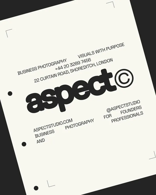
Tilted print collateral for a photography studio featuring bold sans-serif branding and contact details on cream paper against a dark background.
Summary
Tilted print collateral for Aspect Studio, a London-based photography business, using bold monochromatic typography and minimal graphic elements on cream paper.
Visual description
A cream or off-white business card or letterhead photographed at a 45-degree angle against a dark charcoal background. The design features "aspect" in bold, blocky sans-serif caps as the dominant element, positioned center-right. Contact information appears in smaller caps above and below: "VISUALS WITH PURPOSE" with phone and London address, and "BUSINESS PHOTOGRAPHY" with "@ASPECTSTUDIO" and "FOR FOUNDERS & PROFESSIONALS" text. Three small decorative corner marks (line segments) frame the card edges at the top-left, top-right, and bottom-left. A dot accent appears at left. The typographic hierarchy is built entirely through size, weight, and spacing; no colors beyond black ink and the cream substrate.
Key takeaway
Bold, letterpress-scale typography without embellishment; the corner marks as a low-cost, high-impact framing device; rotation as a visual story technique in product photography; minimal information density combined with generous negative space on print collateral.
Reuse notes
Strong reference for boutique agency or creative studio identity systems. The tilted presentation works well in portfolio mockups or case studies. Scale the corner marks for business cards, letterheads, or envelope designs; they also adapt to digital headers and badges.
More like this




Keep what you find
A free account saves references to boards and can send you a weekly email of picks based on what you save.
To see every result, go Pro.