Preview image. Unlock full-res
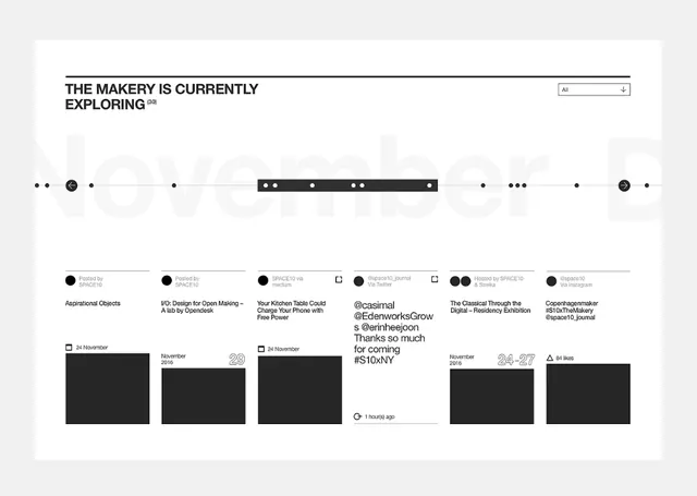
Minimalist monochrome portfolio index showing a horizontal navigation row punctuated by bullet separators and a grid of past project thumbnails with metadata tags.
Summary
Archive or collection index using horizontal navigation punctuation (dot separators) above a monochrome grid of thumbnail entries, each with title, date, and category tags.
Visual description
Full-width layout on white background with a bold sans-serif headline "THE MAKERY IS CURRENTLY EXPLORING" at top, flanked by a search/filter control on the right. Below, a single horizontal line of black dots and circles of varying sizes acts as navigation or filtering UI, creating rhythm across the width. Beneath that, a four-column grid of archive entries. Each entry is a black or dark-gray rectangular block (likely image placeholder or thumbnail) with accompanying text below: left-aligned title, small date stamp, and category indicators. The typography is clean and hierarchical: display weight for headline, lighter weight for entry labels. All elements sit on generous white space with subtle gray dividers.
Key takeaway
The dot/circle navigation motif is distinctive and scalable to any number of categories. The grid's metadata presentation (title + date + tag in a compact stack) efficiently conveys archive depth. The generous whitespace and monochrome palette create trust and focus, letting the thumbnails or content become the emphasis point.
Reuse notes
Ideal for portfolio, exhibition, or publication archives where curatorial depth is a selling point. The navigation pattern works for category filters, timeline views, or faceted search. Best suited to design, art, photography, or media portfolios; the restrained palette emphasizes content over presentation.
More like this






Keep what you find
A free account saves references to boards and can send you a weekly email of picks based on what you save.
To see every result, go Pro.