Preview image. Unlock full-res
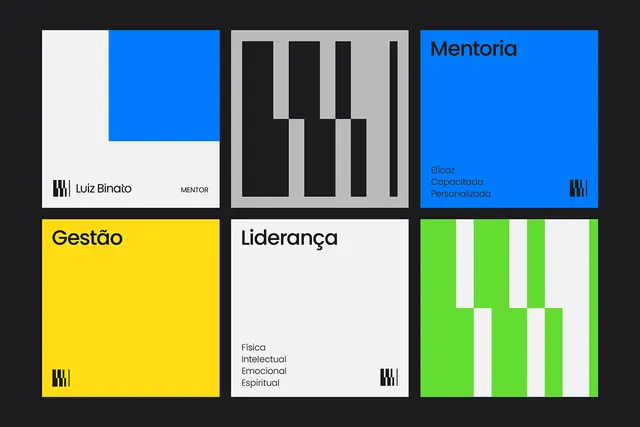
A 3x2 grid of boldly colored geometric cards, each representing a service pillar in a Brazilian mentorship coaching brand identity.
Summary
A 3x2 grid of boldly colored geometric cards, each representing a service pillar in a Brazilian mentorship coaching brand identity.
Visual description
Six equal-sized squares on a charcoal background. Top-left: a white square with a bright blue geometric shape (rectangle) in the upper portion and text reading "Luiz Binato MENTOR" at the bottom, with a small geometric icon. Top-center: a light gray square with a pattern of black staggered vertical bars creating an abstract rhythm. Top-right: a bright blue square with "Mentoria" in bold black sans-serif, three Portuguese descriptors in blue (Eficaz, Capacitada, Personalizada), and the small geometric icon. Bottom-left: a bright yellow square with "Gestão" in oversized black sans-serif and the icon. Bottom-center: a white square with "Liderança" in black sans-serif, below which are four Portuguese terms (Física, Intelectual, Emocional, Espiritual) in smaller gray type, and the icon. Bottom-right: a bright lime-green square with a white vertical striped pattern creating a ladder or rhythm effect, and the icon. Each card uses the same small geometric mark consistently, anchoring the modular system.
Key takeaway
The modular card system enforces consistency while allowing each service category its own distinct color and visual treatment. The abstract geometric patterns (vertical bars, striped rhythm) serve as secondary visual identity, differentiating cards without type. The color palette (primary blue, accent yellow, lime-green) creates energy and confidence. Each card stands alone but is clearly part of a larger system through shared iconography and grid structure.
Reuse notes
Ideal for service-based businesses with multiple offerings (coaching, consulting, agencies, professional services). The modular grid works for printed materials (business cards, brochures), digital platforms (website sections, app dashboards), or signage. The bold colors suit positioning as confident and action-oriented. Portuguese labels indicate this brand serves a Latin American market; translate or adapt labels for other regions. The geometric-pattern secondary system avoids type-heavy explanations on each card, making it legible across sizes and languages.
More like this







Keep what you find
A free account saves references to boards and can send you a weekly email of picks based on what you save.
To see every result, go Pro.