
Preview image. Unlock full-res
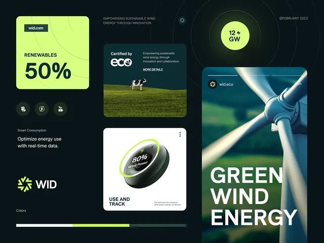
Renewable energy brand guideline showcasing vibrant royal blue and lime green color system, geometric logo mark, typography, and imagery standards across modular grid layout.
Summary
Renewable energy brand guideline using vibrant royal blue and lime green color blocking, geometric logo mark, icon system, and nature imagery across modular brand pages.
Visual description
Comprehensive brand guideline pages arranged in modular grid showing: top-left page on bright lime green background with "brand guideline" heading and subtitle text; top-center page on royal blue showing "Who We Are" heading with yellow flowing geometric mark and paragraph text; top-right page showing color palette swatches and brand values. Middle row: left shows "Logo" section with geometric curved mark in lime and black outlined on light background with variations; center shows "Logo Varieties" with color-usage rules on dark background; right shows "Typography" on royal blue with large display "Aa" letterform. Third row: left shows "Our Vision" in black curvy mark on lime green; center shows "Brand Values" with smiling woman holding plant on natural background; right shows typography specs. Bottom row: "Logo Icon" showing three icon variations of mark in lime, white, and black on blue background; "Imagery Style" showing nature/architecture photography examples; rightmost shows "Designed By" credit on royal blue. Throughout: consistent use of bright lime green and royal blue color separation, white space, and geometric / rounded forms.
Key takeaway
Bold color blocking using just two primary colors (royal blue and lime green) with high contrast and minimal neutral grayscale creates visual punch without feeling chaotic. Geometric logo mark (flowing curved lines) becomes a modular system that works as full logo, icon set, and pattern element. Organizing brand guide into distinct topic pages with consistent size and grid alignment makes complex information feel structured and scannable. Pairing warm human photography (woman with plant) against stark blue-green color fields creates visual relief and human connection in a technical document.
Reuse notes
Excellent model for renewable energy, sustainability, tech startups, and innovation-focused brands where energetic visual language builds credibility. The lime-green-on-blue combination reads as modern and forward-thinking, appropriate for companies targeting environmental consciousness. Works well in digital-first applications and presentation decks. The geometric logo mark scales from favicon to billboard. Imagery approach (nature photography with professional color correction) pairs well with the bold color palette. Best suited for B2B brands in climate, energy, or technology sectors seeking to appear both trustworthy and innovative.
More like this





Keep what you find
A free account saves references to boards and can send you a weekly email of picks based on what you save.
To see every result, go Pro.