Preview image. Unlock full-res
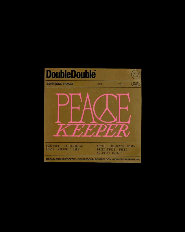
Contemporary coffee label with a goldenrod background, hot-pink serif wordmark with integrated peace symbol, and black technical typography.
Summary
Contemporary artisanal coffee package label featuring a large hot-pink serif wordmark with a stylized peace symbol as the letter A, set against a goldenrod rectangular field with structured, all-caps black metadata.
Visual description
Rectangular label on black background. Top section: "DoubleDouble" in bold black sans-serif, production number and weight ("001 / 9oz / 250g") in smaller black type. Center dominates: "PEACE KEEPER" in large hot-pink serif caps, the A formed by a circle with a single vertical line (peace symbol), letterforms have generous serifs and slight italic lean. Below: black all-caps text listing roast profile ("ESPRESSO ROAST"), tasting notes ("CHOCOLATE. HONEY. DRIED FRUIT. SWEET. ACIDITY: BRIGHT"), and small footer ("@DOUBLEDOUBLECOFFEE : DOUBLEDOUBLECOFFEE.COM : ROASTED IN PERTH, WA"). Gold/tan and black dominate; hot-pink is the single bold accent. Structured grid layout with tight vertical spacing between text blocks.
Key takeaway
The peace-symbol-as-letterform idea: using a meaningful vector glyph to replace or modify a letter in a word creates instant recognition and a story. The hot-pink accent on a warm-neutral background is a contemporary take on retro color pairing. Separating the main brand word (top) from the product name (center) and specs (bottom) creates visual hierarchy without size variation alone.
Reuse notes
Effective for specialty coffee, artisanal food, or lifestyle brands seeking a retro reference with modern edge. The centered composition works well on square labels or rectangular package sleeves. Hot-pink benefit requires confident brand voice; pairs well with goldenrod, brown, or cream grounds. Tasting-notes metadata in this format suits high-end roasters or single-origin origins.
More like this


Keep what you find
A free account saves references to boards and can send you a weekly email of picks based on what you save.
To see every result, go Pro.