Preview image. Unlock full-res
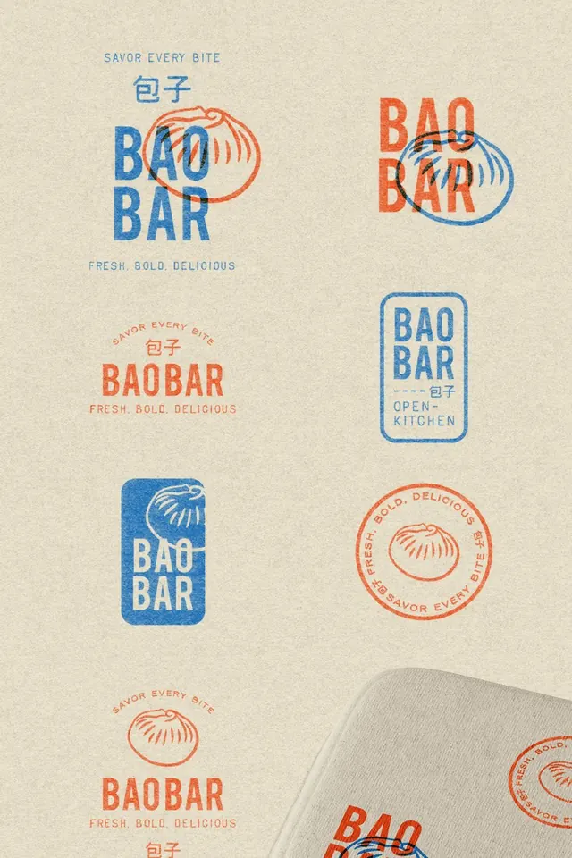
Restaurant branding identity featuring multiple logo lockups in blue and orange duotone with hand-drawn bao steamers as a mark.
Summary
Branding system for Bao Bar, a food brand, featuring six logo variations combining the wordmark "BAO BAR" with stylized hand-drawn bao steamer illustrations in a bold blue and orange duotone palette.
Visual description
A systematic branding layout shows six distinct logo treatments for a dumpling restaurant brand. Each uses the same color system: bright cobalt blue and vibrant orange on a warm cream background. The wordmark "BAO BAR" appears in all caps, blocky sans-serif. Central to each mark is a simple hand-drawn illustration of a steamer basket (bao) rendered as concentric lines. Variations include: stacked wordmark with bao to the right, horizontal lockup, landscape badge format, vertical rectangular badge with Chinese characters (包子) above, and circular seal marks with "SAVOR EVERY BITE" and "FRESH. BOLD. DELICIOUS" taglines radiating around the edge. Some versions show the mark applied to brown kraft paper or napkins, suggesting real-world usage.
Key takeaway
The versatile duotone logo system that works at multiple scales; the hand-drawn steamer basket as a memorable visual anchor; the contrast between clean sans-serif type and the organic, sketchy illustration style; strategic use of all-caps condensed type for impact.
Reuse notes
Excellent reference for food and beverage branding, especially casual dining or fast-casual concepts where playfulness and accessibility matter. The duotone color approach keeps production costs down while maintaining visual distinctiveness. Works particularly well for QR codes, packaging, signage, and digital menus. The system is intentionally modular, making it easy to apply to different mediums without losing brand recognition.
More like this

Keep what you find
A free account saves references to boards and can send you a weekly email of picks based on what you save.
To see every result, go Pro.