Preview image. Unlock full-res
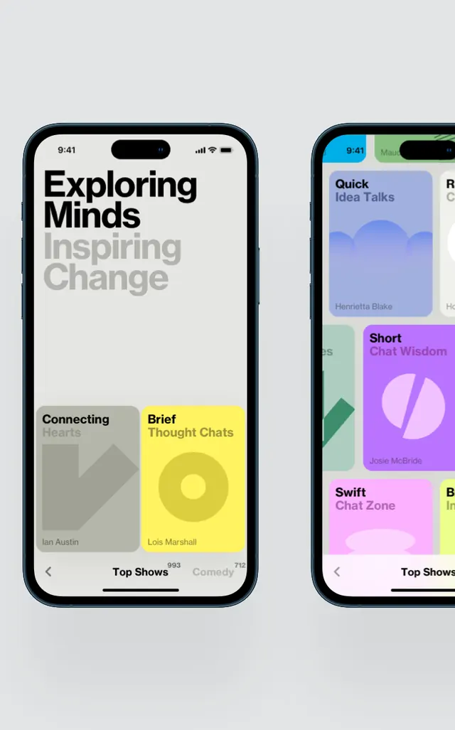
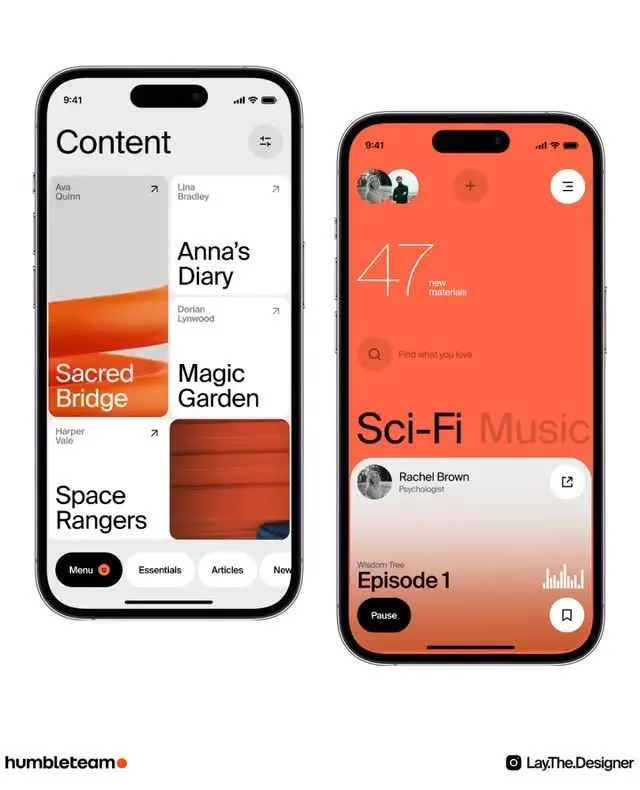
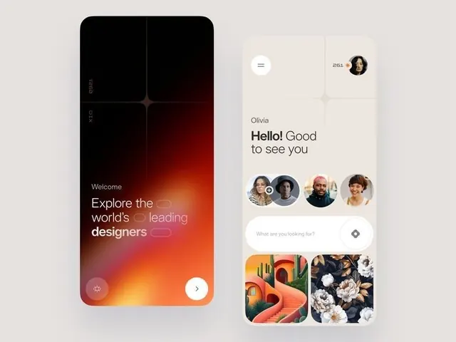
Dual-screen mobile interface pairing a warm gradient welcome screen with a personalized content-discovery card grid for a social design platform.
Summary
Two mobile screens showing contrasting approaches to onboarding and navigation: a full-bleed warm gradient introduction on the left, a clean white card grid with user profiles and visual content on the right.
Visual description
Left screen: full-bleed warm gradient transitioning from burnt orange at top through deep red to darker maroon at bottom, with large white sans-serif type reading "Explore the world's leading designers" and a play or navigation button at bottom. Right screen: predominantly white background with personalized greeting "Hello! Good to see you Olivia" at top, user profile avatar grid below (4 circular avatars), search input with icon in center, and 2x2 grid of visual content cards (abstract gradient patterns and floral imagery) below. Both screens use consistent navigation styling; left emphasizes emotional welcome via color, right emphasizes content discovery via modular grid layout.
Key takeaway
The gradient's temperature shift (warm to cool as it darkens) creates emotional depth without pattern or texture. The right screen's card grid balances whitespace with content density. Both screens share sans-serif family but differ in color context, showing how the same typeface adapts across onboarding stages.
Reuse notes
Strong template for community or creative platforms. The gradient-first approach works for building emotional investment in welcome sequences. The profile-grid pattern is reusable for discovery, recommendations, or collaboration features. Best suited to content-heavy or social-first apps where users need both inspiration and connection.