Preview image. Unlock full-res
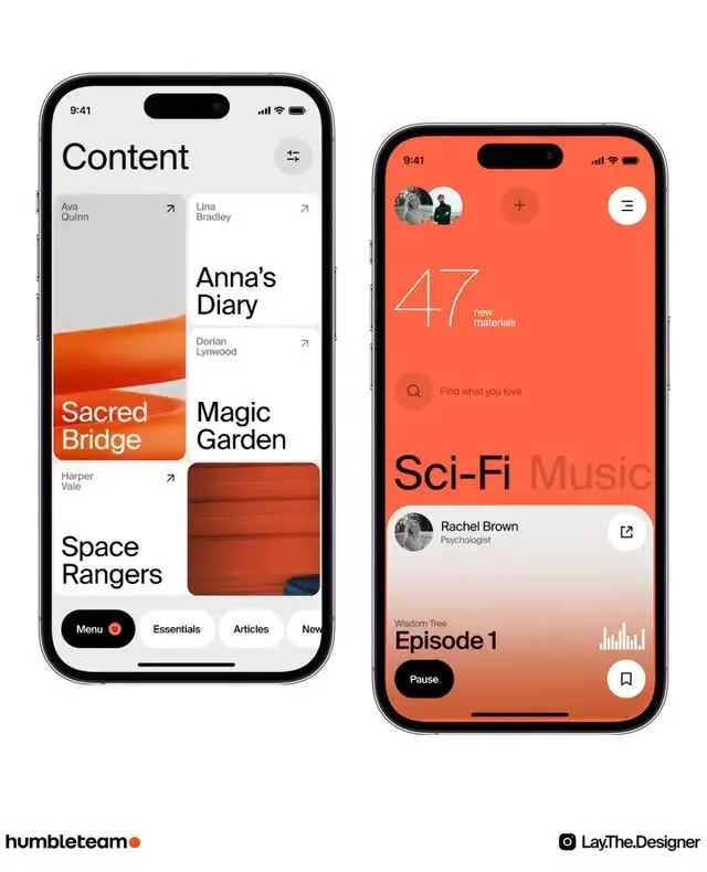
Two iOS app mockups demonstrating a content library grid and music streaming player with warm coral accents and card-based UI patterns.
Summary
Side-by-side iOS mockups of a media app: left screen shows a content grid with warm-toned card tiles and bold typography; right screen displays a music player with full-bleed coral background and layered floating cards.
Visual description
Left iPhone (light background): title "Content" with filter icon, followed by a two-column grid of medium-sized cards containing book or show titles (e.g. "Anna's Diary", "Sacred Bridge", "Magic Garden", "Space Rangers") in bold sans-serif, each with a thumbnail image or solid color block. A footer navigation bar has a rounded menu button with orange dot accent. Right iPhone (coral background): title "Sci-Fi Music" in black sans-serif, a circular user avatar with initials, a large "47 new materials" count in line-art numerals, a search bar ("Find what you love"), and below, a featured card showing "Rachel Brown" with nested "Episode 1" player controls. Both screens use generous margins, clear type hierarchy, and white or muted elements on light backgrounds, with the coral screen creating a bold secondary state.
Key takeaway
The left screen's grid of content cards with thumbnail images maintains scannability without becoming chaotic. The right screen's full-bleed color background and large numerals ("47") create a memorable, confident primary interaction point. The floating card on the music screen suggests depth and layers. The warm coral accent unifies both screens despite their different layouts, making them feel part of one system.
Reuse notes
Excellent reference for content discovery apps, music streaming services, and podcast platforms. The card-based grid on the left works well for browsing catalogs; the dedicated player screen on the right is a proven pattern for active playback. The warm coral accents differentiate this from generic neutral mobile designs. Bottom-sheet navigation and floating cards are performance-friendly iOS patterns. The dual-screen presentation shows flow between primary and detail states, ideal for pitch decks or design system documentation.
More like this


Keep what you find
A free account saves references to boards and can send you a weekly email of picks based on what you save.
To see every result, go Pro.