Preview image. Unlock full-res
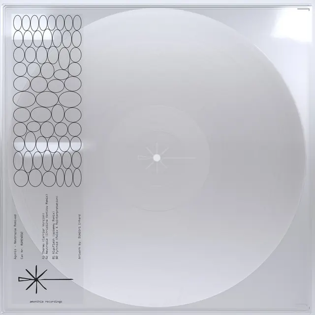
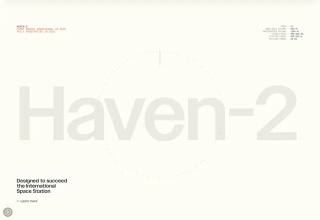
Minimalist vinyl pressing label concept: a large translucent circular form centered on white, ringed with faint radial lines and a target crosshair, paired with a vertical grid of outline circles and vertical text detail on the left edge.
Summary
Minimalist vinyl pressing label concept: a large translucent circular form centered on white, ringed with faint radial lines and a target crosshair, paired with a vertical grid of outline circles and minimal vertical text detail on the left edge.
Visual description
A large circular form dominates the composition, filled with a subtle light-grey gradient and rimmed with faint concentric rings and radial hairlines converging at a small center dot (resembling a vinyl record's center hole and grooves). The circle sits centered on a white background. To the left, a vertical grid of outline circles (arranged in rows of eight, extending the full height) creates a rhythmic side-border pattern. Extremely minimal text runs vertically on the far left in monospace type, barely legible at this resolution. The overall effect is technical, precise, and architectural, resembling both a vinyl label and a technical specification sheet.
Key takeaway
Use radial lines and concentric rings as subtle texture that implies circular motion without animation. A grid of simple shapes on one edge creates rhythm and documentation-like structure while keeping the main form spacious. Translucent layers and monochrome palette convey precision and production-readiness.
Reuse notes
Perfect for music labels, vinyl pressing documentation, or any brand needing to convey manufacturing precision and minimal aesthetic. The radial symmetry works equally well as a standalone mark or as a design system element. Works best when the full documentation (printed or digital) supports the ultra-minimal approach.
More like this



Keep what you find
A free account saves references to boards and can send you a weekly email of picks based on what you save.
To see every result, go Pro.