Preview image. Unlock full-res
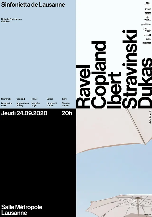
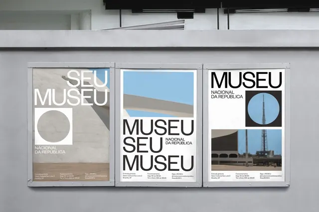
Event poster split vertically: dense typographic left side naming venue and exhibition details versus airy right side with maps, line diagrams, and minimal graphics in cool blue and neutral tones.
Summary
A cultural event poster balancing dense typographic information on the left against cartographic and diagrammatic elements on the right, unified by cool, restrained color and lots of negative space.
Visual description
The poster divides into two compositional halves. The left third anchors a dark text block with event title, date, location, and metadata in small sans-serif type. The right two-thirds open into light blue and off-white fields containing minimal line maps, geometric diagrams, and sparse typography positioned to suggest location and movement. A subtle beige accent band runs horizontally across the lower portion. The overall palette is cool and institutional, with white space and narrow lines doing most of the design work.
Key takeaway
The radical asymmetry creates sophistication without decoration: text density on one side licenses emptiness on the other. Minimal line maps and diagrams feel editorial and precise rather than decorative. The cool palette and generous spacing make institutional design feel refined rather than bureaucratic.
Reuse notes
Strong model for cultural institution identity, event posters, and exhibition materials. Works particularly well when the left column must carry significant information hierarchy. The cool blue grounds the design in trustworthiness and is adaptable to nonprofit, arts, and academic contexts.
More like this

Keep what you find
A free account saves references to boards and can send you a weekly email of picks based on what you save.
To see every result, go Pro.