Preview image. Unlock full-res
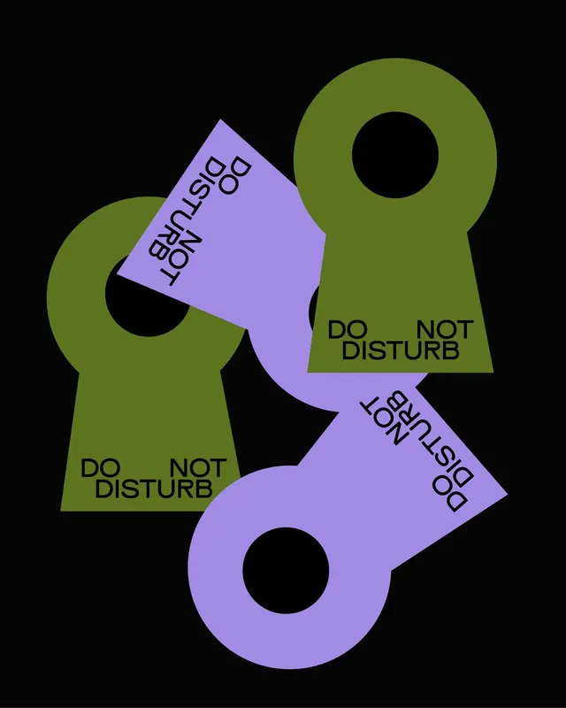
Three overlapping door-hanger shapes in olive green and lavender purple announce 'DO NOT DISTURB' with rotated text blocks against a black background.
Summary
Three overlapping keyhole-shaped door hangers in olive green and lavender purple display "DO NOT DISTURB" messaging at different angles against pure black, creating a layered, instructional composition.
Visual description
Black background serves as negative space for three bold geometric forms. Two solid olive-green hangers with large circular cutouts frame a rotated lavender-purple shape in the center. Text placement varies: "DO NOT DISTURB" appears in black sans-serif across two of the green shapes horizontally and vertically, while the purple form carries rotated text oriented diagonally. The overlapping creates depth and rhythm without additional shading or effects. All typography is uppercase, condensed, and tightly tracked for maximum legibility.
Key takeaway
The use of complementary color contrast (cool olive-green against warm lavender) for visual pop without introducing clutter. The layered composition where individual shapes maintain clear readability despite overlap. The typographic rotation at multiple angles, which guides the eye through the composition and maintains visual interest while serving functional messaging.
Reuse notes
Perfect for hospitality signage, hotel door hangers, or any context requiring friendly-but-firm "do not disturb" communications. The flat geometric style scales well from small physical hangers to large environmental graphics. Works effectively in warm or cool color palettes; the olive-lavender pairing is sophisticated and accessible. Spacing hangers at different angles suits asymmetric layouts.
More like this



Keep what you find
A free account saves references to boards and can send you a weekly email of picks based on what you save.
To see every result, go Pro.