Preview image. Unlock full-res
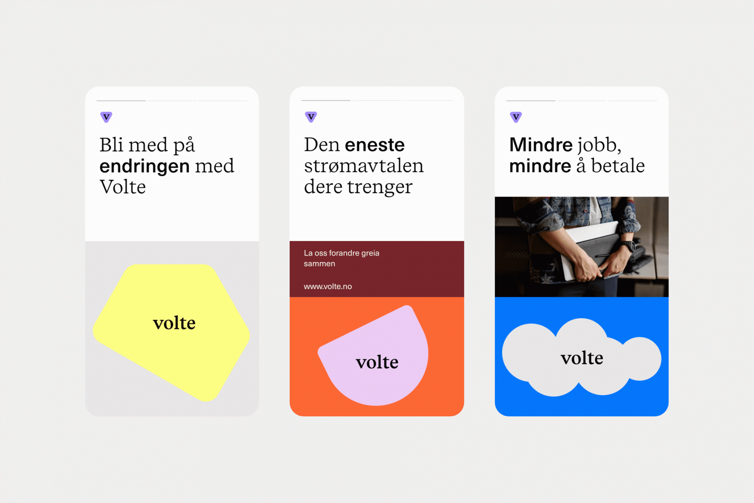
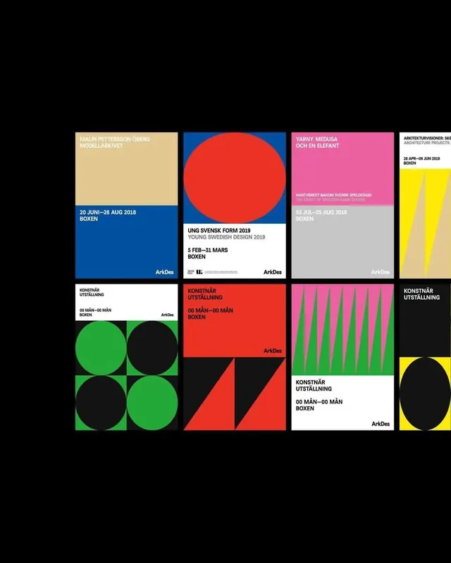
A 12-panel grid of event promotional cards with pure color fields, bold diagonal splits, and minimal sans-serif typography, each card advertising different conference themes in neon primaries against black.
Summary
A 12-panel grid of event promotional cards with pure color fields, bold diagonal splits, and minimal sans-serif typography, each card advertising different conference themes in neon primaries against black.
Visual description
A 3x4 grid of identical-sized square cards on black, each featuring a solid or split-color field (bright yellow, blue, green, red, or purple) with a diagonal or organic boundary. Each card carries event copy in bold, condensed white sans-serif, all-caps or mixed case, naming themes like "CHANGE", "TALKING", "BUILDING", "SHARE". Several cards pair solid color with a soft photographic inset (architecture, people, materials). The grid is tightly packed with minimal gutters, creating strong visual rhythm through hue contrast alone. Typography is hierarchical: large event name, smaller descriptive text, sometimes a small date or location line.
Key takeaway
The directness of solid-color card fields paired with diagonal splits or organic shapes to break monotony without decoration. The all-caps, bold sans-serif titling feels urgent and event-driven. The grid itself (12 equal cards in 3x4) is an elegant way to showcase multiple offerings while maintaining visual unity.
Reuse notes
Perfect template for event series, conference promotion, or product lineup grids. Works best when each card needs visual distinction without losing overall cohesion. The solid colors and diagonal splits reduce visual noise compared to full photography, making text read fast at any size.
More like this


Keep what you find
A free account saves references to boards and can send you a weekly email of picks based on what you save.
To see every result, go Pro.