Preview image. Unlock full-res
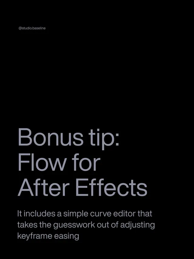
Dark instructional interface explaining After Effects workflow with headline, descriptive body text, and studio branding at top left.
Summary
An educational interface screen teaching After Effects keyframe easing techniques, using dark monochrome tones with generous whitespace to emphasize instructional text.
Visual description
Pure black background with minimal content hierarchy. Studio branding "@studio.baseline" appears as small gray text in the upper left. The headline "Bonus tip: Flow for After Effects" occupies the lower third in large, light-gray sans-serif. Below, explanatory body text in slightly smaller gray states "It includes a simple curve editor that takes the guesswork out of adjusting keyframe easing." Typography is clean, contemporary, and highly readable against the black field with ample vertical spacing between text blocks.
Key takeaway
The restraint in using negative space and dark backgrounds for instructional content, which removes visual noise and focuses attention on the message. The clear typographic hierarchy (headline larger than body) without additional visual ornaments. The subtle branded watermark placement that does not compete with educational content.
Reuse notes
Ideal for software tutorials, educational documentation, or technical guides where clarity and focus matter more than visual richness. Works particularly well for motion-graphics or video-production documentation. The dark background reduces eye strain during extended reading and pairs well with motion preview regions.
More like this


Keep what you find
A free account saves references to boards and can send you a weekly email of picks based on what you save.
To see every result, go Pro.