Preview image. Unlock full-res
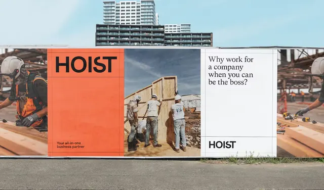
A split billboard for construction recruitment featuring a bold orange block with HOIST branding and on-site photography, paired with a white panel and provocative copy.
Summary
An outdoor employment billboard split into two halves: a bold burnt-orange left panel with HOIST logo and construction-site photography, and a white right panel with direct, challenging copy.
Visual description
Wide landscape billboard composition divided into two unequal sections. Left side (roughly 55%): large burnt-orange color block with white HOIST logotype and candid site photography showing construction workers in hard hats. Right side (45%): clean white background with dark gray monospace or sans-serif body text reading "Why work for someone when you can be the boss?" Small HOIST mark at bottom right. The typography on the white panel is left-aligned and deliberately understated, allowing the orange block and imagery to dominate. Subtle shadows and wood-tone accents in the photo suggest the texture of the site. The composition is tense and asymmetric, creating visual pull toward the messaging.
Key takeaway
Stark color block and photography contrast grab attention from distance. The provocative copy question feels direct without being aggressive, inviting self-reflection. Asymmetric 55/45 split avoids midpoint monotony and channels movement.
Reuse notes
Effective for recruitment, contractor, and B2B campaigns targeting trade workers and skilled labor. High contrast color works on roadside and transit. The approach suits industries (construction, manufacturing) where visual boldness and plain language build credibility.
More like this



Keep what you find
A free account saves references to boards and can send you a weekly email of picks based on what you save.
To see every result, go Pro.