Preview image. Unlock full-res
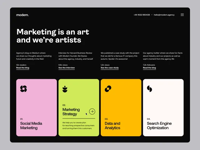
Dark background with bold headline and four neon-colored service cards (pink, lime, orange, white) arranged in a grid.
Summary
Dark hero section leading with a bold headline and four numbered service cards in contrasting neon hues, centered around a marketing agency's core offerings.
Visual description
Black background with white and light-gray text. Oversized headline in white sans-serif spans two lines. Below is body copy describing the agency's philosophy, followed by four full-width call-to-action links. The main visual element is a 2x2 grid of service cards: numbered 01-04, each with a small icon (symbol shapes), a title in sans-serif, and a brief description. Card colors are hot pink, vibrant lime green, bright orange, and off-white, creating high-contrast visual separation. Cards have rounded corners and sit flush against each other.
Key takeaway
The neon card-color blocking against a dark ground creates immediate visual hierarchy. The grid numbering (01, 02, 03, 04) feels systematic without being cold. The icon badges are minimal and memorable. The combination of a bold headline + body copy + structured cards tells a complete service story in one view.
Reuse notes
Strong for agencies and marketing firms needing to showcase multiple service lines at a glance. Works well on dark landing pages or hero sections. Pair this approach with a CTA button below the grid. The lime/pink/orange combo is bold and youthful; dial down saturation if the brand is more corporate.
More like this


Keep what you find
A free account saves references to boards and can send you a weekly email of picks based on what you save.
To see every result, go Pro.