Preview image. Unlock full-res
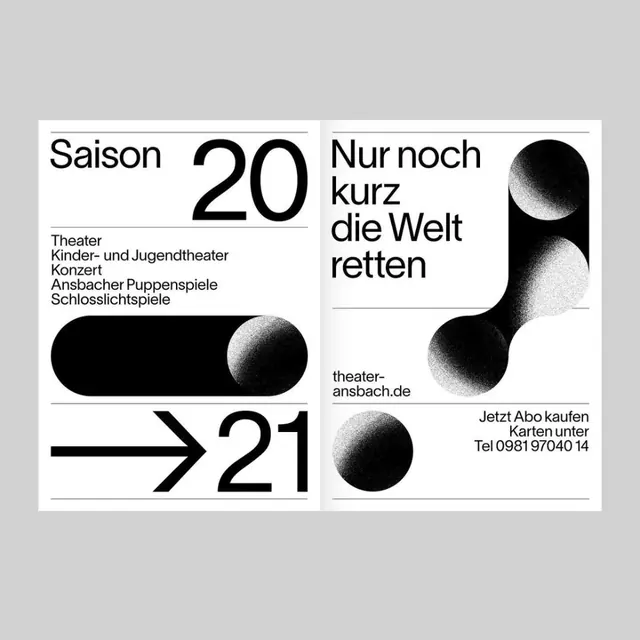
German theater season poster with bold sans-serif numbering, split-panel layout, and abstract black spheres creating visual tension and movement.
Summary
Minimalist German theater season poster balancing typography and abstract black spheres across two asymmetric panels to communicate season number and venue information with stark clarity.
Visual description
Two white panels on a light grey background. Left panel: small sans-serif footer text listing theater categories (Kinder- und Jugendetheater, Konzert, Ansbacher Pupperspiele, Schlosslichtspiele), followed by large black display numerals "20" centered vertically with an abstract black curved/teardrop shape beside it. Right panel: sans-serif headline reading "Nur noch kurz die Welt retten" (Only save the world a little longer) in large, bold type, left-aligned. Below: fine-print footer with website and ticket information, paired with another abstract black sphere overlapping the edge between panels. A bold black arrow pointing right appears between "20" and "21" at the panel junction, emphasizing forward motion and sequence.
Key takeaway
Oversized numerals dominate the composition while smaller typography handles hierarchy naturally. Abstract black curved shapes (spheres, teardrop forms) create visual interest and movement without imagery, and their asymmetric placement guides the eye. The split-panel layout separates information logically while the directional arrow unifies the composition. High contrast and generous negative space make the design feel intentional and premium.
Reuse notes
Well-suited for arts, theater, and cultural institutions where restraint signals sophistication. The abstract geometric shapes add personality without decoration. The directional arrow and numeric emphasis work for campaign sequences or multi-year series. Monochrome treatment is economical for print and maintains legibility at all scales. Pair with confident typography choices; this style does not accommodate ornament or photography.
More like this




Keep what you find
A free account saves references to boards and can send you a weekly email of picks based on what you save.
To see every result, go Pro.