Preview image. Unlock full-res
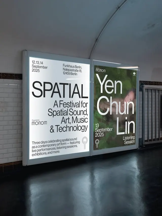
Two-panel illuminated wayfinding display for SPATIAL, a Berlin festival of spatial sound, art, and music using bold typography and atmospheric imagery in stark contrast.
Summary
Two-panel illuminated wayfinding display for SPATIAL, a Berlin festival of spatial sound, art, and music using bold typography and atmospheric imagery in stark contrast.
Visual description
Two large backlit panels mounted horizontally on a curved gallery wall. Left panel: white background with black sans-serif text in a clean, geometric typeface; event title "SPATIAL" in large caps, dates and venue (Funkhaus Berlin, Nalepestrasse 18), and event description in smaller type explaining "A Festival for Spatial Sound, Art, Music and Technology" with three-day festival dates and activities listed. Right panel: dark muted sage green background with the name "Yen Chun Lin" in white sans-serif, bold and oversized, accompanied by small imagery and text describing a listening session. Both panels sit above a concrete floor with dramatic shadows cast from an overhead curved track light. The curved wall reinforces the industrial architecture. Wayfinding and exhibition identity merge into a single statement.
Key takeaway
Extreme typographic hierarchy: few weights, heavy sans-serif, deliberate negative space. The scale of a single name or title commands attention; supporting information is subordinate but legible. Using negative space (empty white or colored field) to make type float rather than fill the panel. The dual-panel format lets you combine event identity and specific session/artist information without clutter.
Reuse notes
Ideal for cultural institutions, galleries, and event wayfinding. The high-contrast approach reads from distance and photograph equally. Works well for experimental or avant-garde programming where the minimalism reinforces the intellectual positioning. Best deployed in industrial or contemporary architecture where stark, clean geometry is already present.
More like this




Keep what you find
A free account saves references to boards and can send you a weekly email of picks based on what you save.
To see every result, go Pro.