Preview image. Unlock full-res
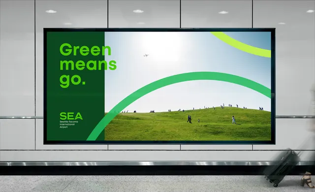
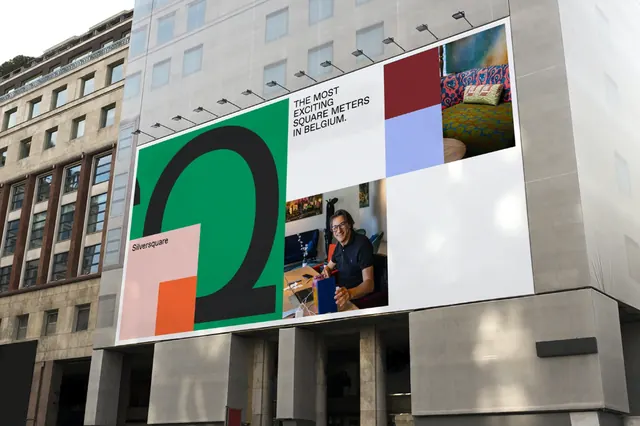
An environmental messaging billboard with lime-green headline text on a dark-green left panel, a panoramic landscape photograph on the right, and a flowing curved green graphic bridging both.
Summary
An installed public billboard split vertically: dark-green text panel on the left with lime-green headline reading "Green means go." above organization branding, and a rolling-landscape photograph on the right, unified by a sweeping curved green graphic element.
Visual description
Split-screen billboard composition mounted on an outdoor wall. Left panel features a dark forest-green background with large lime-green sans-serif headline and smaller sans-serif text (organization name/tagline) in contrasting lighter green. Right panel is a panoramic photograph of rolling green hills with scattered people standing on grass under blue sky, fading from landscape into green foreground. A bold curved graphic—lime green to match the headline—flows from left panel into the landscape, anchoring both sections visually. Black border frame around the entire billboard. Color palette is dominated by greens and cool tones with blue sky, against neutral gray stone building backdrop.
Key takeaway
The asymmetric split-composition technique pairing dense text/messaging on one side with breathing room on the other. The curved bridging element that ties disparate content areas. High-contrast lime-green typography on dark background for legibility and stopping power from distance.
Reuse notes
Effective for public-facing campaigns, nonprofit messaging, sustainability/environmental advocacy. Outdoor scale and bold color choices make it well-suited to public signage. Works well when landscape or environmental imagery is available to anchor the visual side.
More like this





Keep what you find
A free account saves references to boards and can send you a weekly email of picks based on what you save.
To see every result, go Pro.