
Preview image. Unlock full-res
Four horizontal promotional cards using organic deep-green and mint-green shapes paired with circular photography, text, and event details on a light background.
Summary
Four modular promotional cards using organic curved shapes in deep green and mint, anchored by circular photography and event metadata.
Visual description
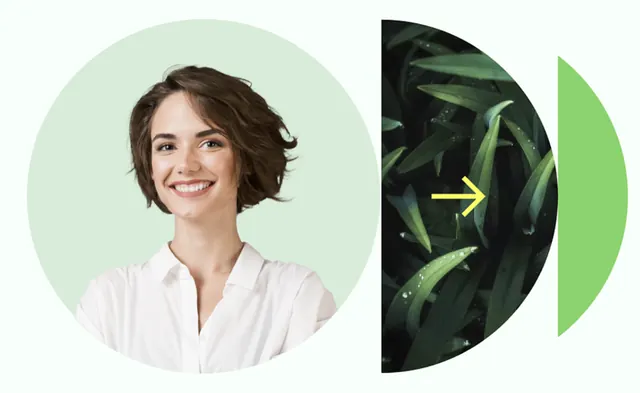
Four rectangular cards aligned horizontally on a light grey background. Each card combines a deep-green or mint-green organic shape (curving, non-geometric forms) overlaid with or paired against a circular photograph or illustration. Text layout varies per card: the first two display large circular images; the third includes an event detail box (green-accented with date and location); the fourth shows event info in a rounded-corner pill layout. At the bottom of each card, the tagline "Vi knytter Helse-Norge sammen" appears in a mix of sans-serif and display type, with "Helse-Norge" in teal. The cards share consistent branding (logo, font family) and rely on ample white space to maintain legibility against the colored overlays.
Key takeaway
The organic, wavy shapes feel welcoming and natural compared to hard-edged geometry, suitable for healthcare and wellness brands. The circular photography crop creates visual interest and humanizes the cards. The modular structure allows flexible arrangement while maintaining brand consistency. The cool, nature-inspired palette (deep green, mint, teal) conveys trust and care.
Reuse notes
Ideal for healthcare, nonprofit, or educational institutions promoting events or programs. The organic shapes work particularly well when the brand tone is approachable and community-focused. Use when you want to soften corporate messaging without sacrificing professionalism.
More like this



Keep what you find
A free account saves references to boards and can send you a weekly email of picks based on what you save.
To see every result, go Pro.