Preview image. Unlock full-res
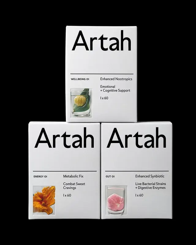
Minimal packaging design for three nutritional supplement products in white boxes with black sans-serif type and lifestyle product photography.
Summary
Three white supplement boxes stacked in a pyramid, each labeled with "Artah" and product variant names (Wellbeing, Energy, Gut), featuring botanical or ingredient photography and clean black typography on uncoated white stock.
Visual description
Clean white box packaging arranged in stacked formation (one centered top, two below). Each box displays bold sans-serif "Artah" headline in black, with a horizontal divider line below. The upper box shows "WELLBEING 01 Enhanced Nootropics, Emotional + Cognitive Support, 1 x 60" with a glass of clear liquid containing a yellow plant specimen. The lower left shows "ENERGY 01 Metabolic Fix, Combat Sweet Cravings, 1 x 60" with an orange dried flower close-up. Lower right displays "GUT 01 Enhanced Synbiotic, Live Bacterial Strains + Digestive Enzymes, 1 x 60" with a pink root vegetable cross-section. Product ingredients photographed against white grounds, monochromatic color palette with black and gray text, uncluttered layout, clinical and scientific aesthetic.
Key takeaway
The stark white-on-white visual hierarchy where typography and product ingredient photography are the only visual noise, making the packaging feel premium and clinically rigorous. The stacked grid layout creates visual cohesion across product variants without pattern or color differentiation. Botanical ingredient photography (not abstract graphics) conveys natural efficacy and transparency.
Reuse notes
Ideal for functional foods, supplements, nutraceutical, and skincare brands where clinical efficacy and ingredient transparency matter. Works for direct-to-consumer wellness brands that target health-conscious consumers. Requires strong, clean product photography to avoid looking sterile or cold.
More like this







Keep what you find
A free account saves references to boards and can send you a weekly email of picks based on what you save.
To see every result, go Pro.