Preview image. Unlock full-res
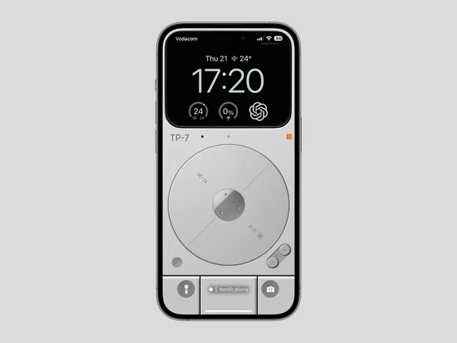
A feature phone interface mockup pairing a dark OLED display showing time and metrics with a lower light gray area containing a large circular dial, physical button controls, and a notification badge.
Summary
A phone interface split into two functional zones: an upper black OLED display showing time (17:20), weather (24 degrees), and three widget icons, and a lower light gray panel with a large circular rotary dial, side buttons, and a notification badge.
Visual description
Portrait phone mockup rendered on a light gray background. Top third: black OLED display with "Vodacom" carrier, signal and battery indicators in the status bar, white sans-serif showing "Thu 21, 24 degrees" on one line, oversized "17:20" time display, and three circular widget icons (temperature 24, humidity 0%, and a circular pinwheel symbol) arranged horizontally below. Middle section: light gray area labeled "TP-7" at top left with two gray dot indicators and a small orange rectangle (app indicator) at right. Dominant feature is a large circle with concentric rings in center-third of gray field, containing a smaller medium-gray circle at the center. Bottom third: horizontal line separating three control zones: left side has a gray circular button with lantern/flashlight icon, center shows an overlay badge reading "5 Notifications" on a light gray background, right side has a gray circular button with camera icon.
Key takeaway
The clear visual separation between display and control zones using stark color contrast (black vs. light gray). The large, tactile circular dial as the primary interaction point, centered and uncluttered. The use of simple iconography and minimal labeling to convey function (flashlight, notifications, camera) without visual noise.
Reuse notes
Effective for hardware interface design, feature phones, or any context where tactile, physical interaction is central. The dial-centric layout works well for media players, rotary selectors, or devices where a single control dominates the interaction model. The monochromatic palette and clear zone separation suit utilitarian, industrial, or accessibility-focused designs where clarity outweighs visual flair.
More like this






Keep what you find
A free account saves references to boards and can send you a weekly email of picks based on what you save.
To see every result, go Pro.