Preview image. Unlock full-res
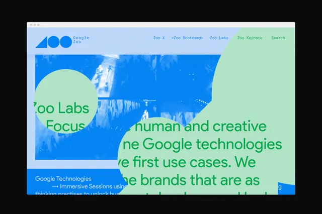
Split digital layout balancing a teal-green curved panel against a bright blue rectangular zone, with overlapping circular form elements and sans-serif type.
Summary
A split-panel abstract composition dividing space into cool-toned zones: teal-green curves on one side, bright electric blue on the other, with soft-edged circular elements suggesting movement and innovation.
Visual description
The layout is divided vertically into complementary zones. The left half uses a light mint teal background with overlapping pale blue and medium teal circle elements creating depth. The right half is vibrant electric blue with visible text fragments ("Human and creative", "Google technologies", partial branding). A dark navy anchor element anchors the left edge. The color contrast between the saturated blue and cool teal is intentionally high. Type is clean, modern sans-serif in white and dark colors, supporting the minimalist palette. White space is generous throughout.
Key takeaway
The discipline of splitting space into two color zones that feel complementary rather than conflicting. The soft-edged circular forms add visual interest without complexity. Using high contrast between cool hues (teal vs. electric blue) rather than warm-cool contrast feels fresher for tech.
Reuse notes
Strong reference for SaaS, developer tools, or B2B tech landing pages where you want to convey innovation without decoration. Works best when the two zones support separate content or navigation. The teal-blue combo reads especially well for anything infrastructure, platform, or tools-focused.
More like this



Keep what you find
A free account saves references to boards and can send you a weekly email of picks based on what you save.
To see every result, go Pro.