Preview image. Unlock full-res
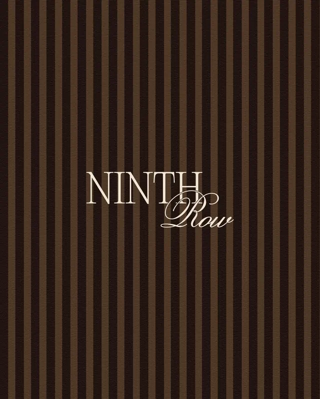
Elegant serif and script wordmark for a luxury wine brand on deep vertical-stripe background.
Summary
Wordmark for NINTH Pour wine brand combining clean sans-serif caps and flowing script on a dark brown vertical-stripe texture.
Visual description
Centered wordmark against an earthy brown background with tight evenly-spaced vertical stripes in alternating tan and dark brown tones. Main text reads "NINTH" in crisp, condensed sans-serif all-caps in white with thin serifs, paired with "Pour" in elegant, flowing script in the same white. The script flows to the right, providing visual contrast and fluidity against the geometric typeface. The stripe pattern fills the entire background, creating texture and depth while maintaining legibility of the mark.
Key takeaway
Pairing a rigid geometric sans-serif with a flowing script in the same composition: creates premium tension between structure and elegance. The tight vertical-stripe background as texture alternative to solid color or photography. Using warm earth tones (browns, tans) as luxury signal in wine/spirits branding.
Reuse notes
Excellent for premium food and beverage brands, especially wine, spirits, or artisanal goods. The stripe pattern is distinctive enough to hold its own; works equally well as a seal/badge or full wordmark layout. Adapt the stripe density and color ratio based on background medium (lighter for darker print, reversed for light backgrounds).
More like this


Keep what you find
A free account saves references to boards and can send you a weekly email of picks based on what you save.
To see every result, go Pro.