Preview image. Unlock full-res
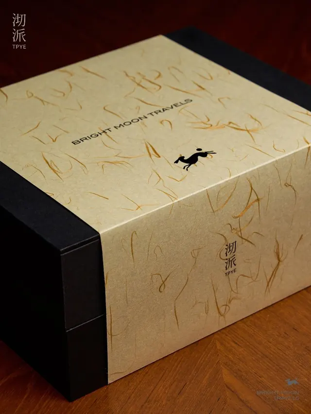
Handcrafted luxury packaging for Bright Moon Travels featuring etched line patterns, black branding on kraft paper, and a leaping-rabbit icon.
Summary
A cubic luxury packaging box for Bright Moon Travels showcasing artisanal kraft paper with hand-etched line patterns and minimal black branding including a stylized leaping-rabbit icon.
Visual description
A cube-shaped box photographed at a three-quarter angle, tilted to show the top and front face. The entire visible surface is natural kraft paper with a dense, hand-drawn or etched pattern of organic flowing lines in burnt orange and warm brown. The box front bears centered black sans-serif type reading "BRIGHT MOON TRAVELS" above a small silhouette of a rabbit in mid-leap. Top-left corner displays bilingual text in white: Chinese characters "湖派" alongside "TPYE" in Latin letters. The back and base edges are a matte black material or binding, creating strong contrast against the warm kraft tone. The overall effect is crafted, tactile, and upscale. Warm overhead lighting casts subtle shadows defining the cube's depth.
Key takeaway
The restraint of using only two colors plus natural material: black typography and icons punching against kraft paper creates premium impact without ornamentation. The hand-drawn line pattern fills the entire surface, providing texture and visual interest while staying in a narrow warm-brown palette. The centered layout and tight kerning of the brand name, combined with a single small icon, project confidence and clarity at various scales. The black edge binding frames the kraft surface and adds dimensional weight.
Reuse notes
Ideal for travel accessories, specialty goods, artisanal product lines, or collectible publishing (boxes for books, cards, curated sets). The kraft material and hand-drawn aesthetic evoke craft and scarcity, working well for products positioned as small-batch or limited-edition. The rabbit motif suggests playfulness or cultural reference; adapting the icon to match a brand's own identity mascot is straightforward. Minimal black branding scales well to small or large formats. Works best when the product inside justifies the premium unboxing experience and crafted material story.
More like this
Keep what you find
A free account saves references to boards and can send you a weekly email of picks based on what you save.
To see every result, go Pro.