Preview image. Unlock full-res
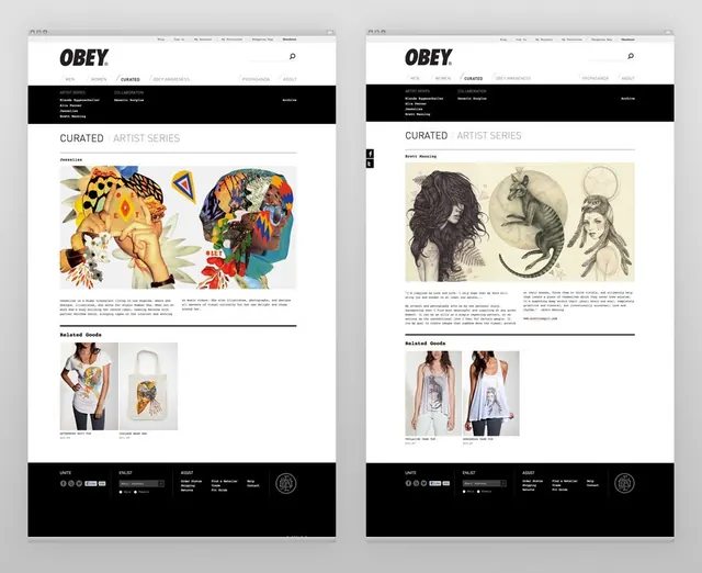
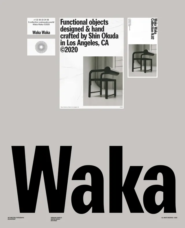
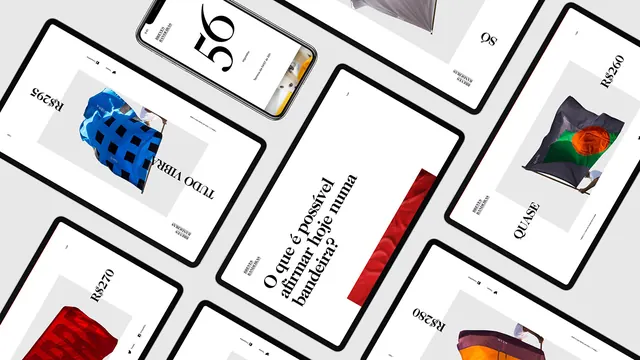
A side-by-side comparison of two brand identity layouts featuring high-contrast imagery, bold typography, and a structured grid system.
Summary
A side-by-side comparison of two brand identity layouts featuring high-contrast imagery, bold typography, and a structured grid system.
Visual description
Two vertical layouts featuring a header with 'OBEY' branding, a central grid of diverse photographic portraits, and a footer with metadata. The left side uses vibrant, colorful illustrations while the right side uses monochrome photography.
Key takeaway
The design demonstrates how a consistent structural grid can unify disparate visual content styles.
Reuse notes
Use this layout structure for portfolio galleries or multi-style brand presentations.
More like this

Keep what you find
A free account saves references to boards and can send you a weekly email of picks based on what you save.
To see every result, go Pro.