Preview image. Unlock full-res
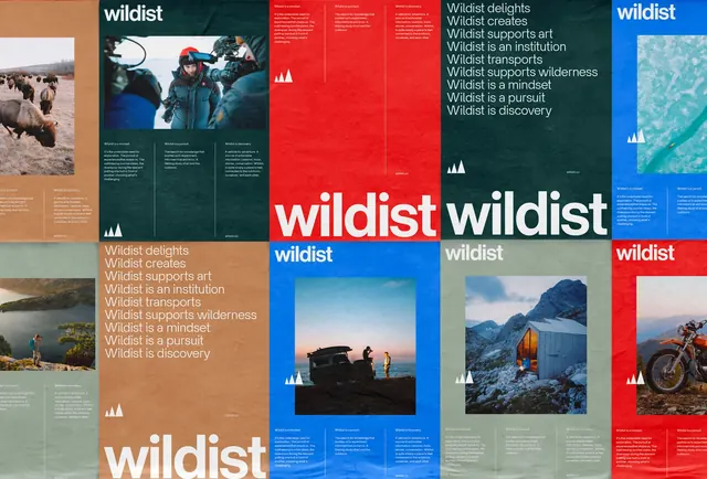
A multi-panel design showcase featuring the 'wildlist' brand identity, incorporating photography, bold typography, and a structured grid layout.
Summary
A multi-panel design showcase featuring the 'wildlist' brand identity, incorporating photography, bold typography, and a structured grid layout.
Visual description
The design uses a modular grid with high-contrast red, blue, and white blocks. It features a mix of nature and human-centric photography paired with bold, sans-serif typography.
Key takeaway
The layout demonstrates how a strong grid system can balance diverse visual elements like photography and text into a cohesive brand identity.
Reuse notes
The modular grid and high-contrast color blocking can be adapted for editorial layouts or multi-channel marketing materials.
More like this
Keep what you find
A free account saves references to boards and can send you a weekly email of picks based on what you save.
To see every result, go Pro.