Preview image. Unlock full-res
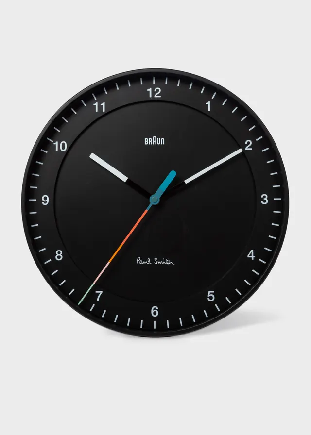
Iconic minimalist watch design with a black dial, stark white numerals, and three subtle colored hands, exemplifying functional modernist product design.
Summary
A Braun watch face designed by Dieter Rams, featuring a black dial with clean white numerals, minimal tick marks, and three subtly colored hands that exemplify "less is more" modernist thinking.
Visual description
Circular watch face set against a light gray background. Deep black dial with white numerals (1-12) in a simple sans-serif font and matching white hour tick marks. Three watch hands: a white hour hand and minute hand (wider), a thin blue second hand, and a red/orange accent hand. Braun branding in white serif type at the bottom left, "Dieter Rams" attribution in smaller serif text below. The overall composition is perfectly centered and radially symmetric, with no decorative elements or complications.
Key takeaway
The restraint: every element earns its place. The color accent (single red/blue hand) breaks monotone without chaos. Thin strokes and negative space against the black field create legibility without visual noise. The numerals are readable at any size because of the stark contrast and generous spacing.
Reuse notes
A reference for product and industrial design, especially timepieces, dashboards, or any interface requiring clarity without embellishment. The style works well for premium or technical brands. The red accent is iconic to Braun and may feel copied if reused; consider a single accent color sparingly. Requires high contrast backgrounds to maintain legibility.
More like this






Keep what you find
A free account saves references to boards and can send you a weekly email of picks based on what you save.
To see every result, go Pro.